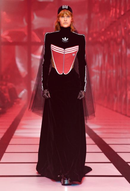
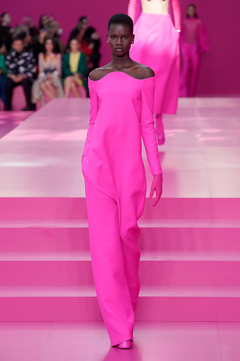
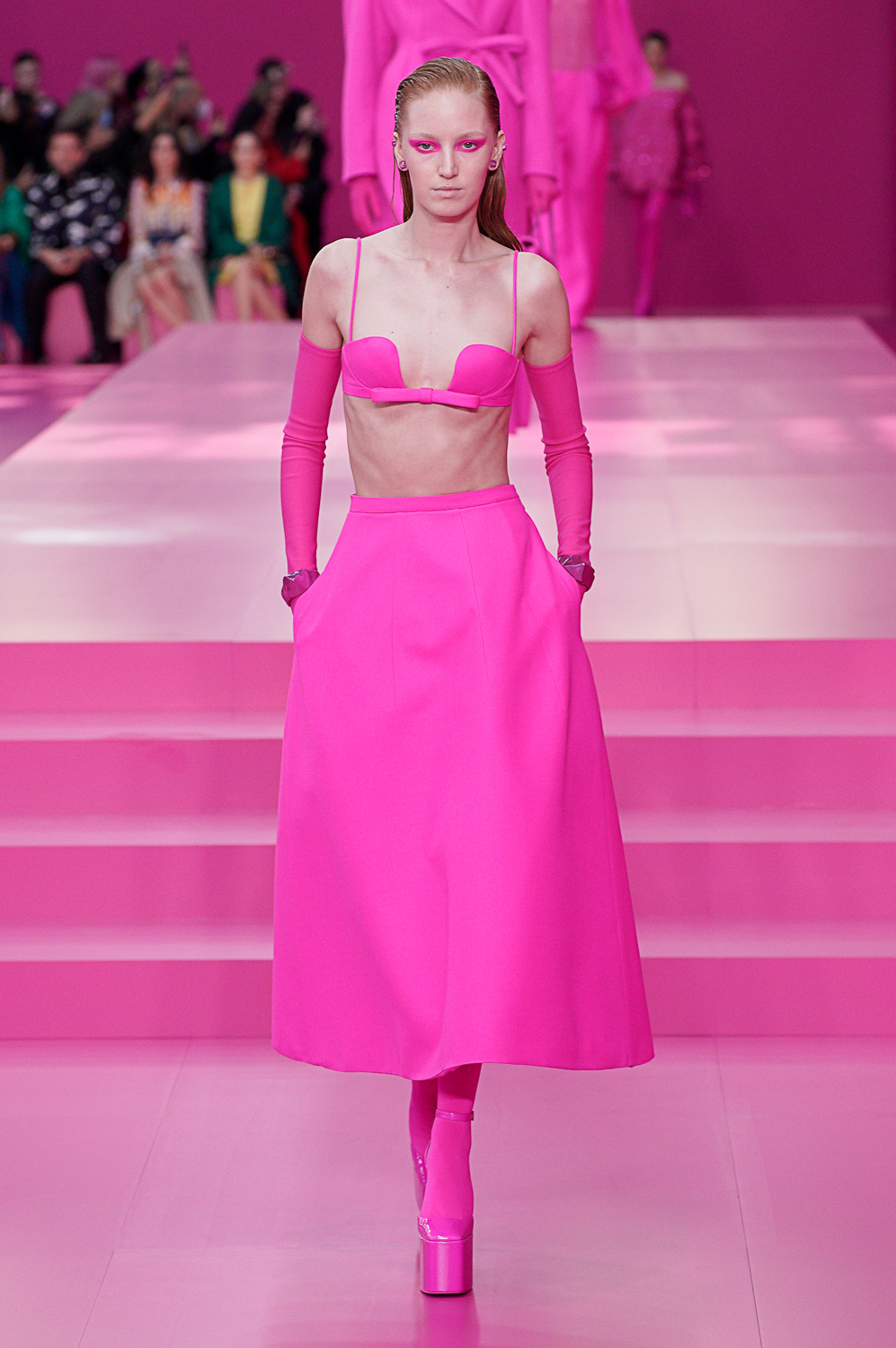
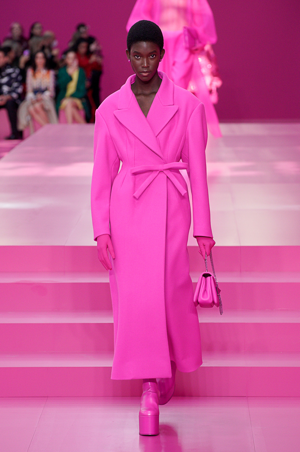
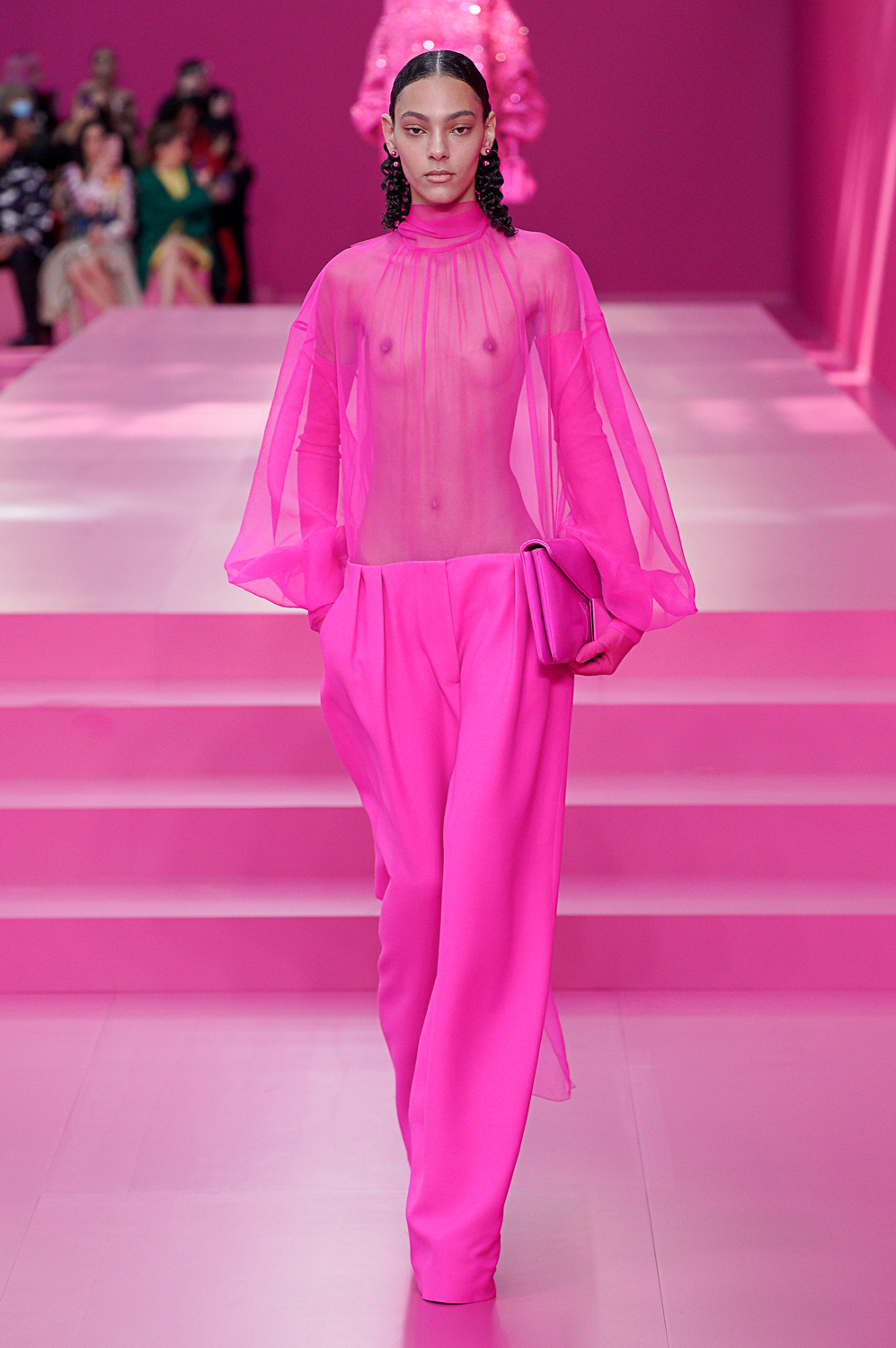
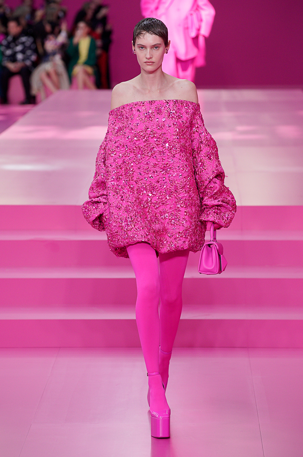
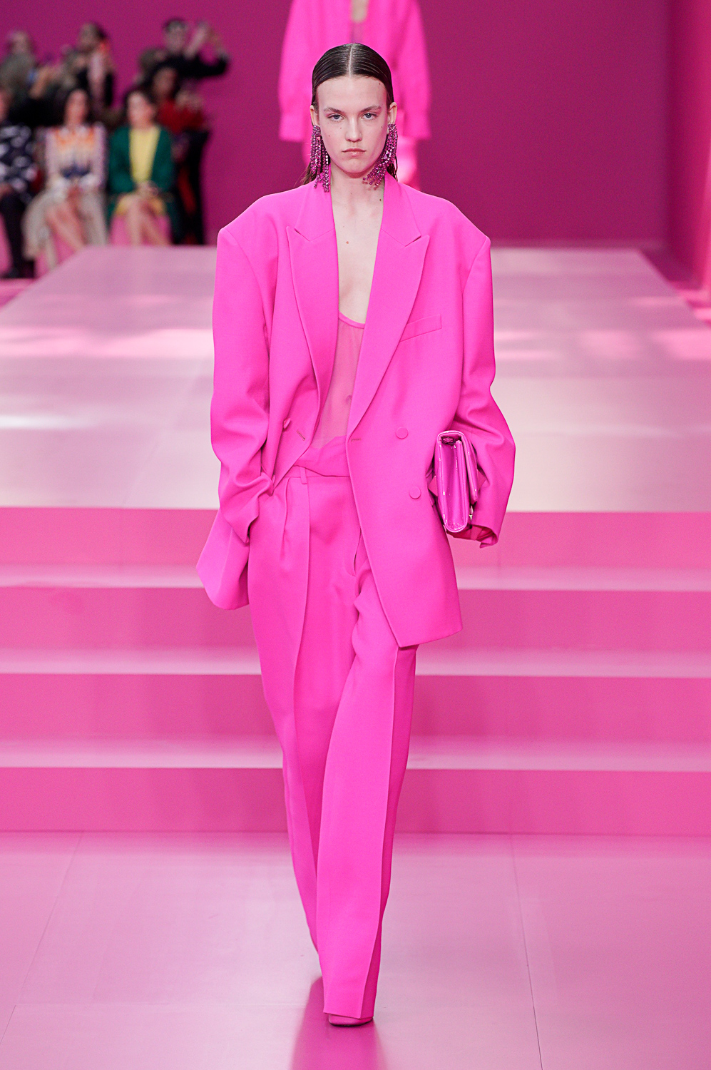
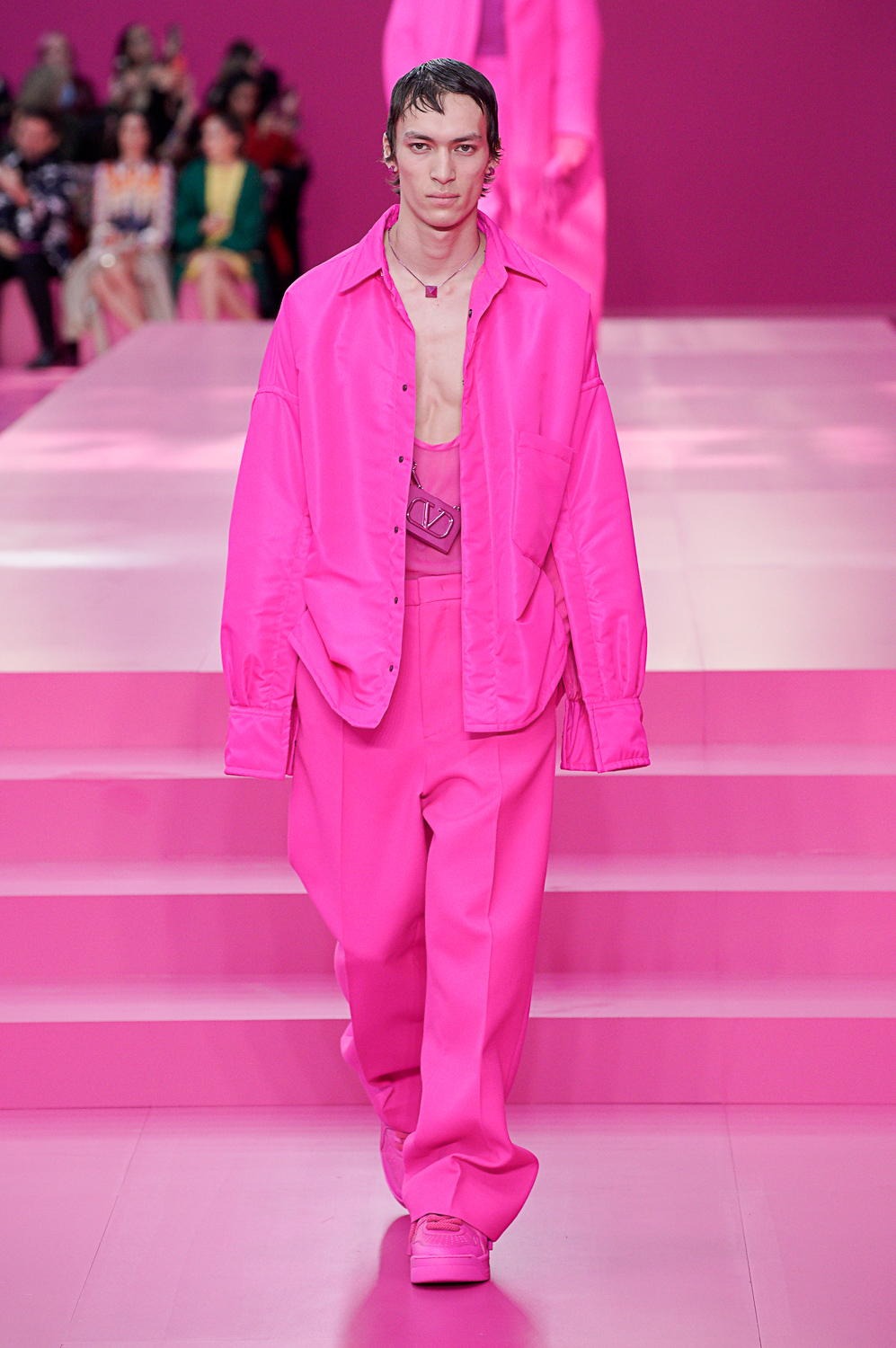
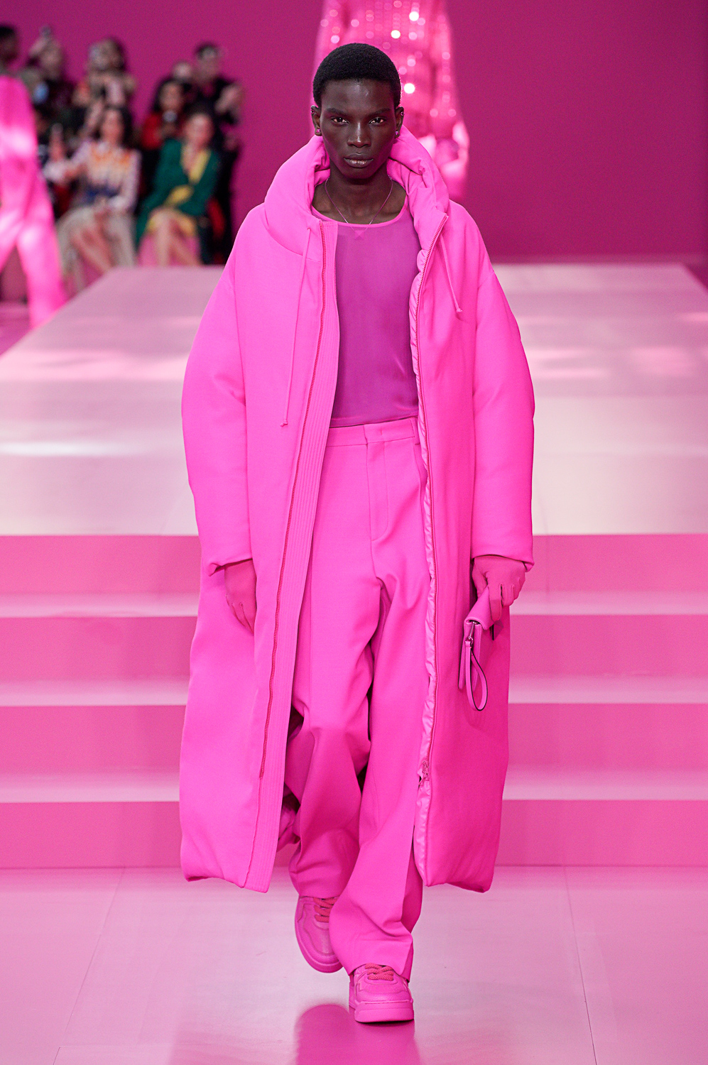
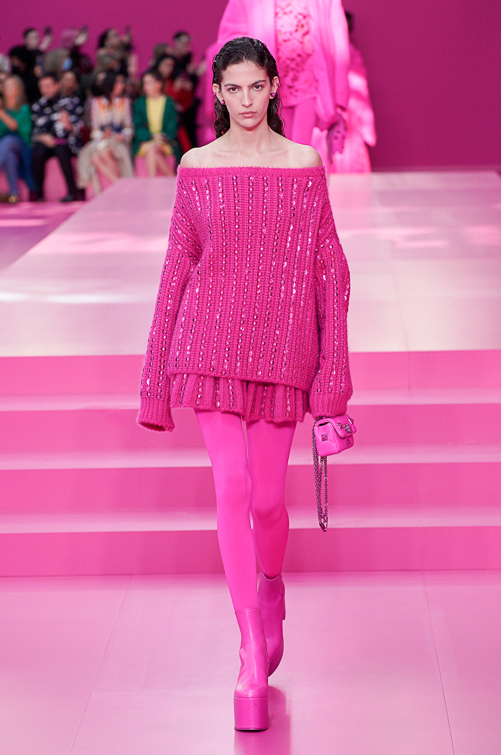
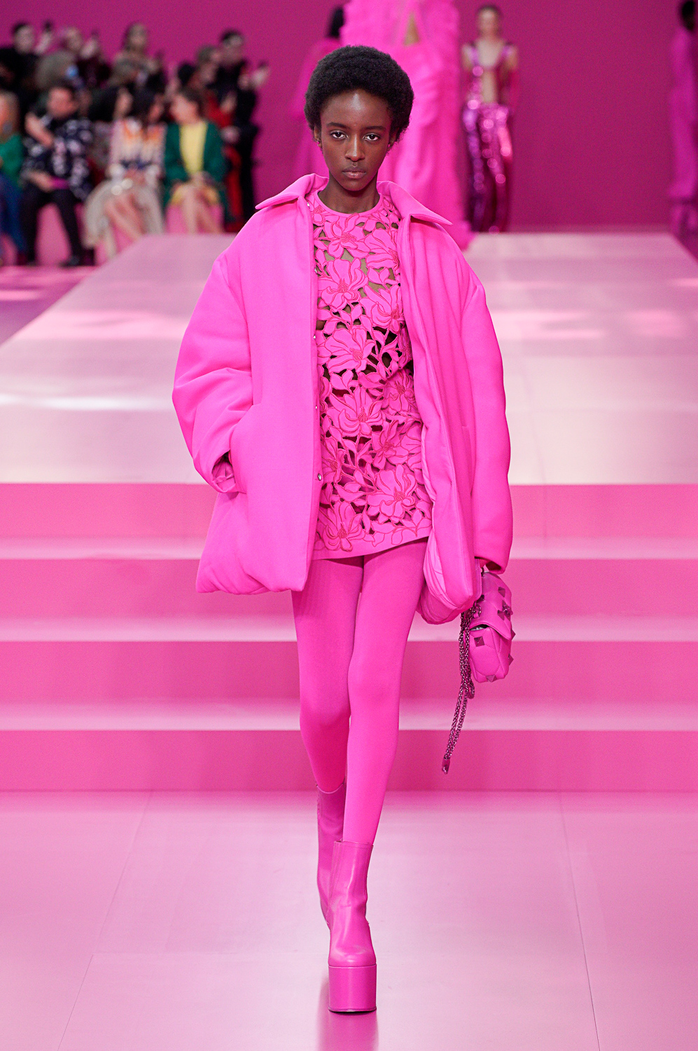
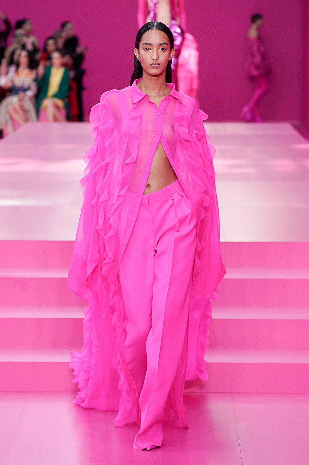
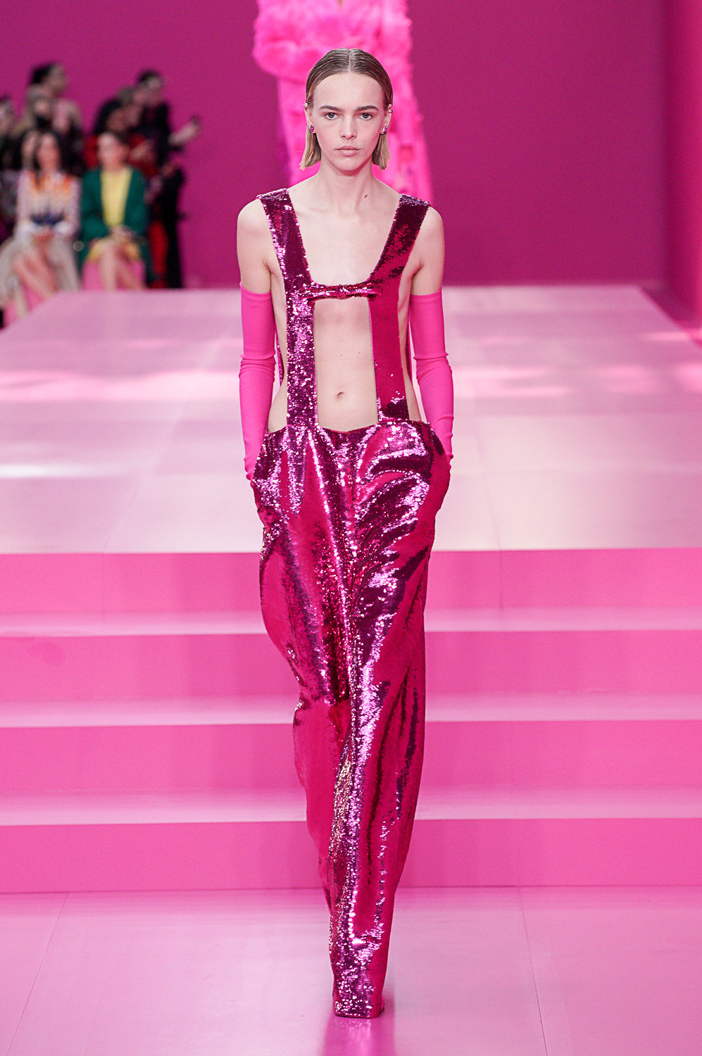
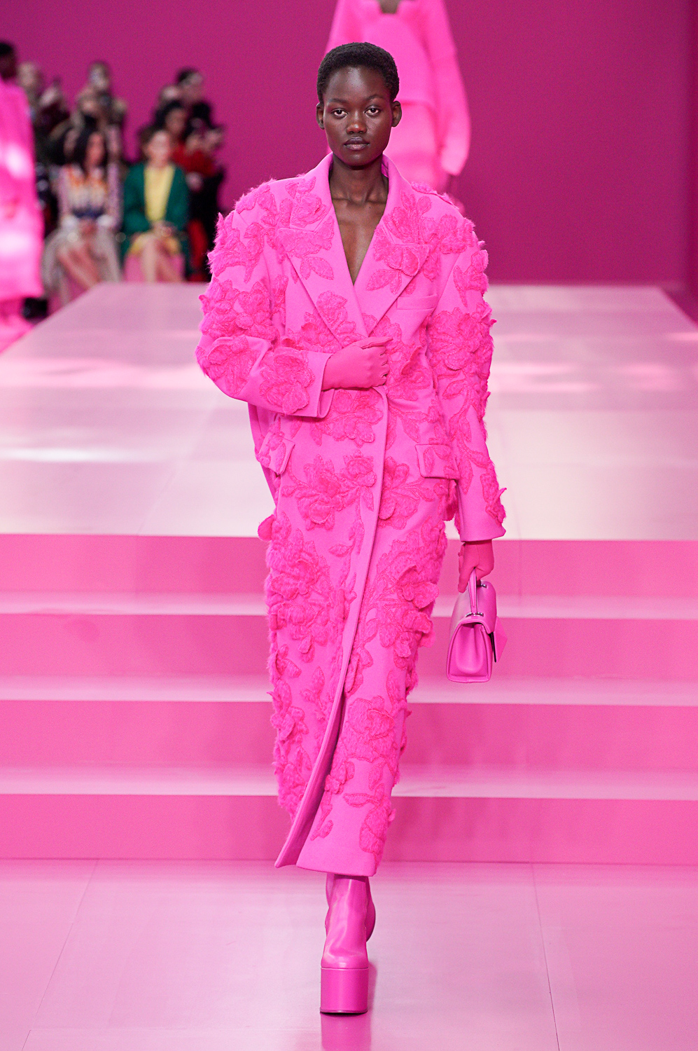
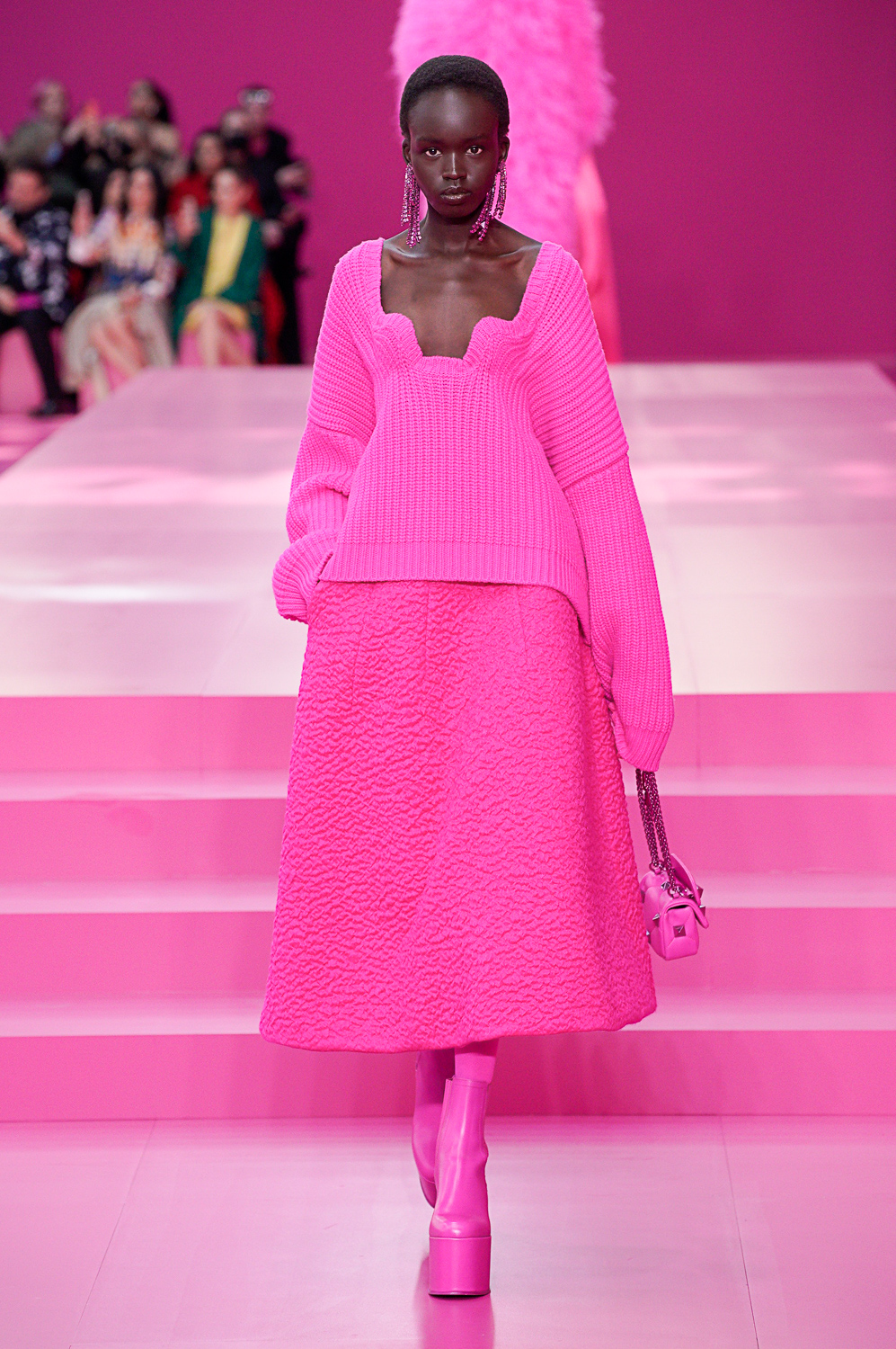
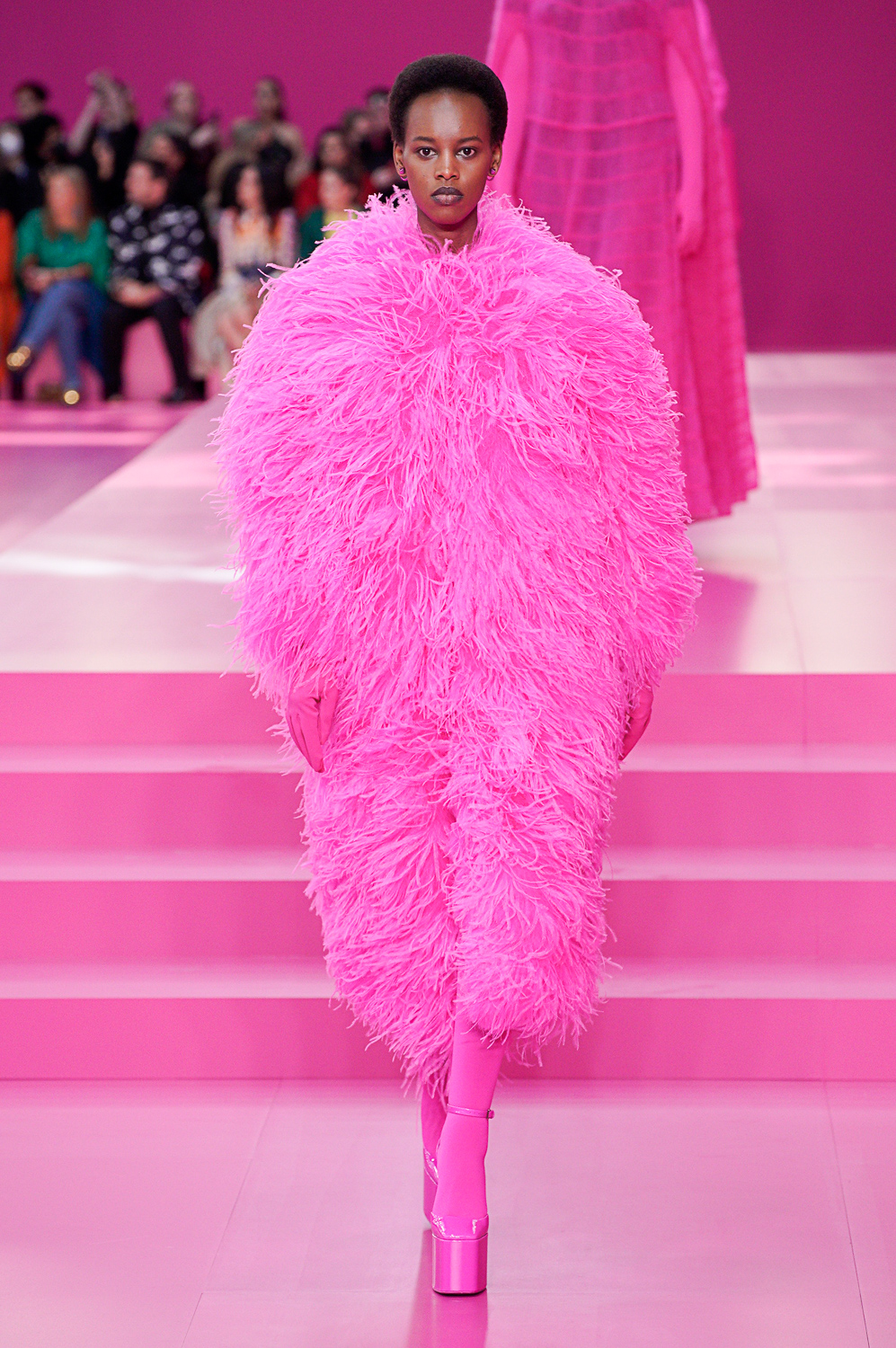
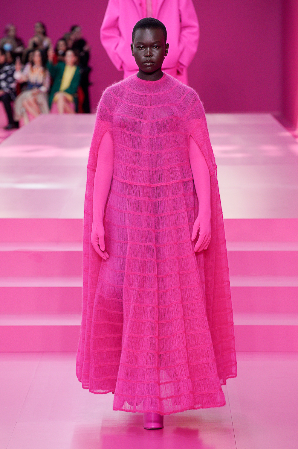
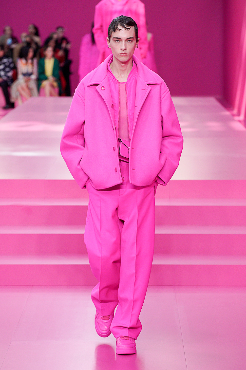
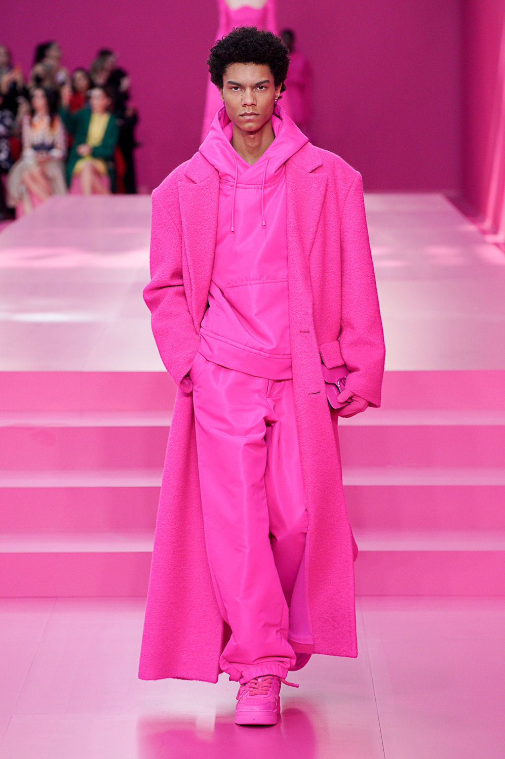
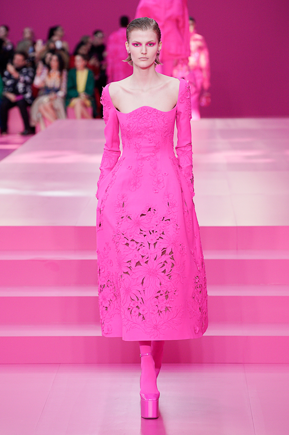
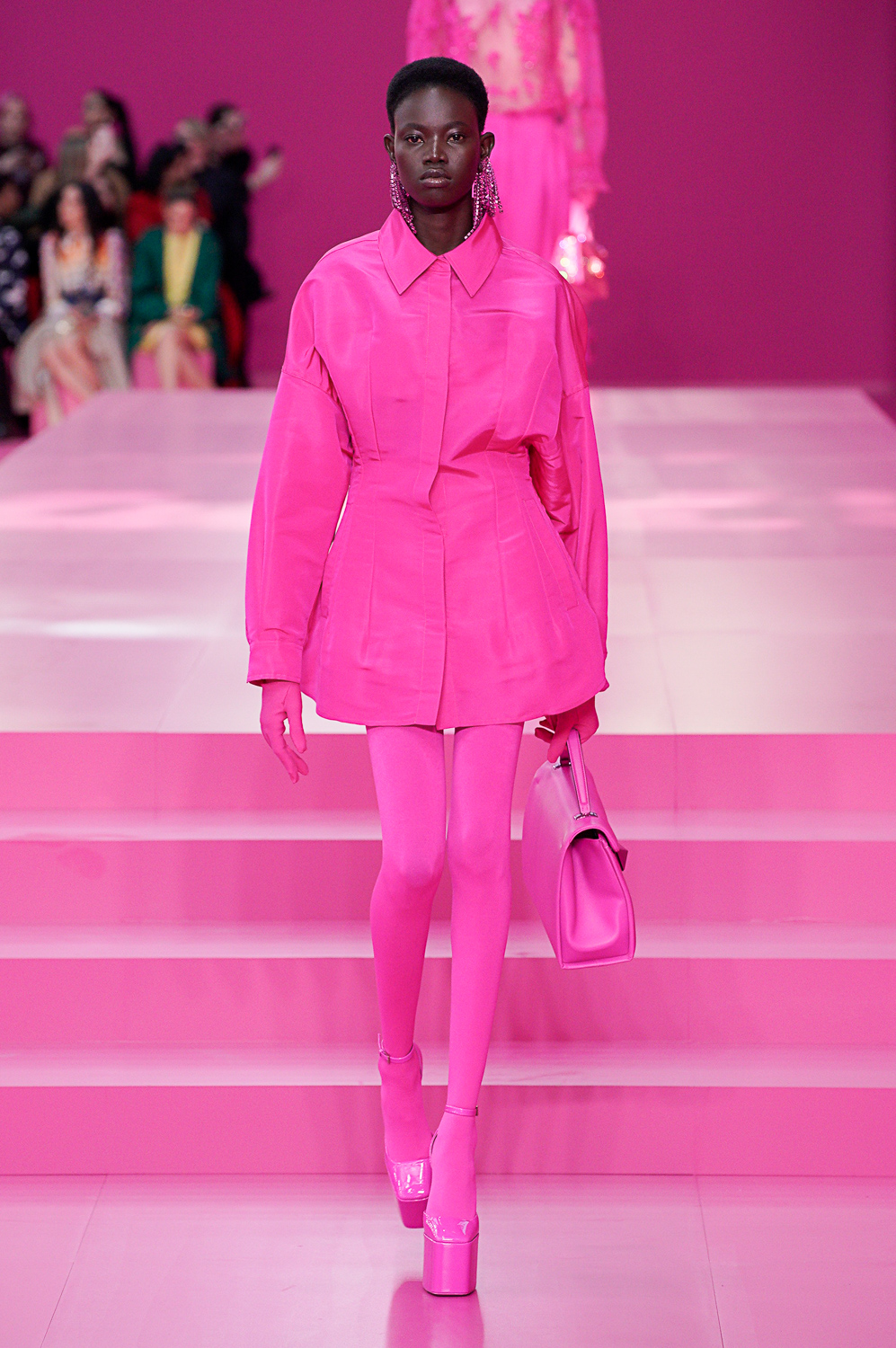
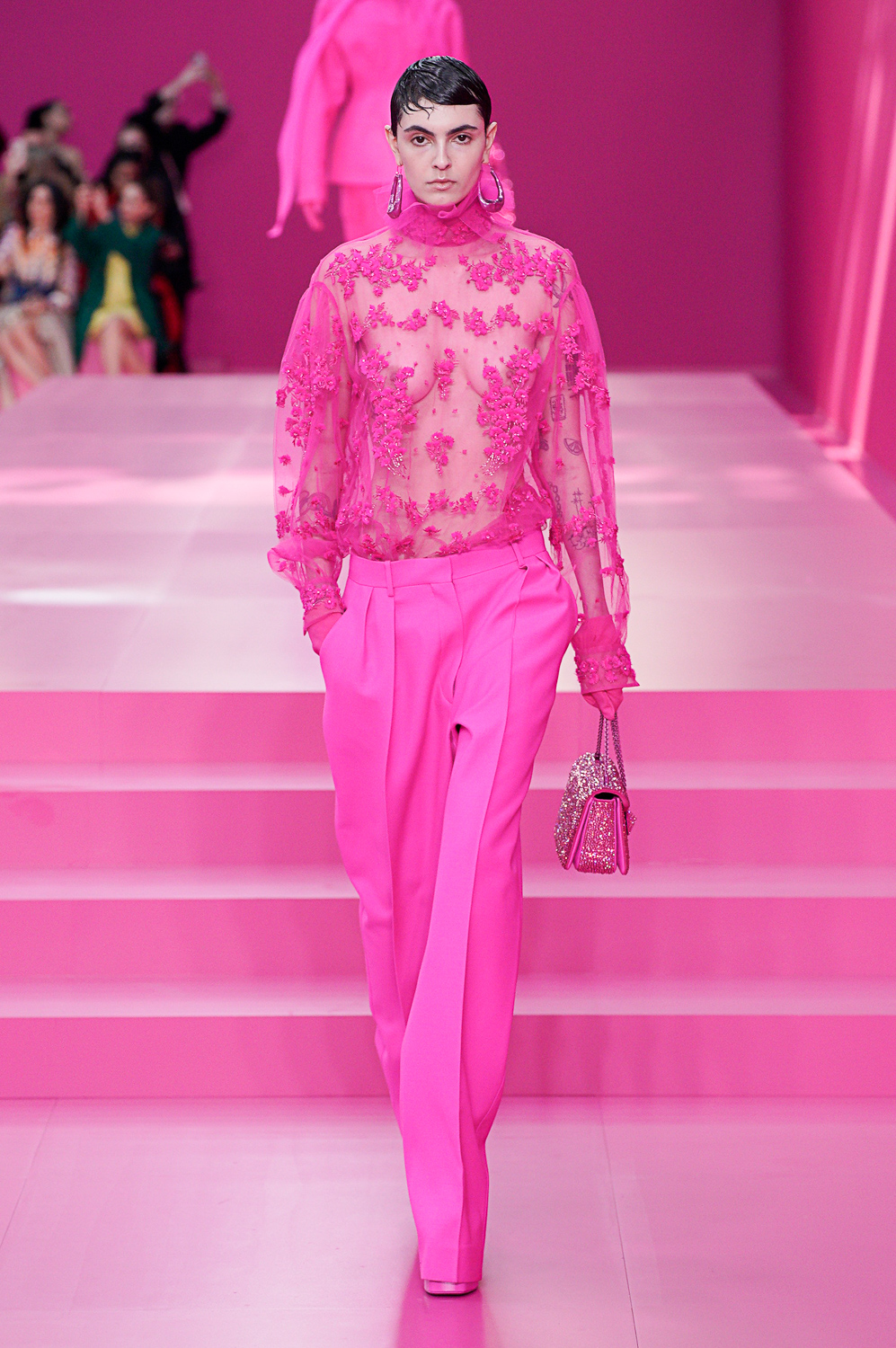
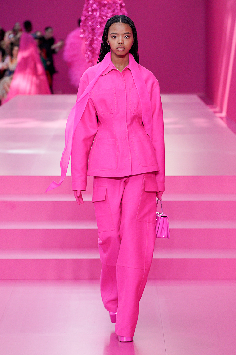
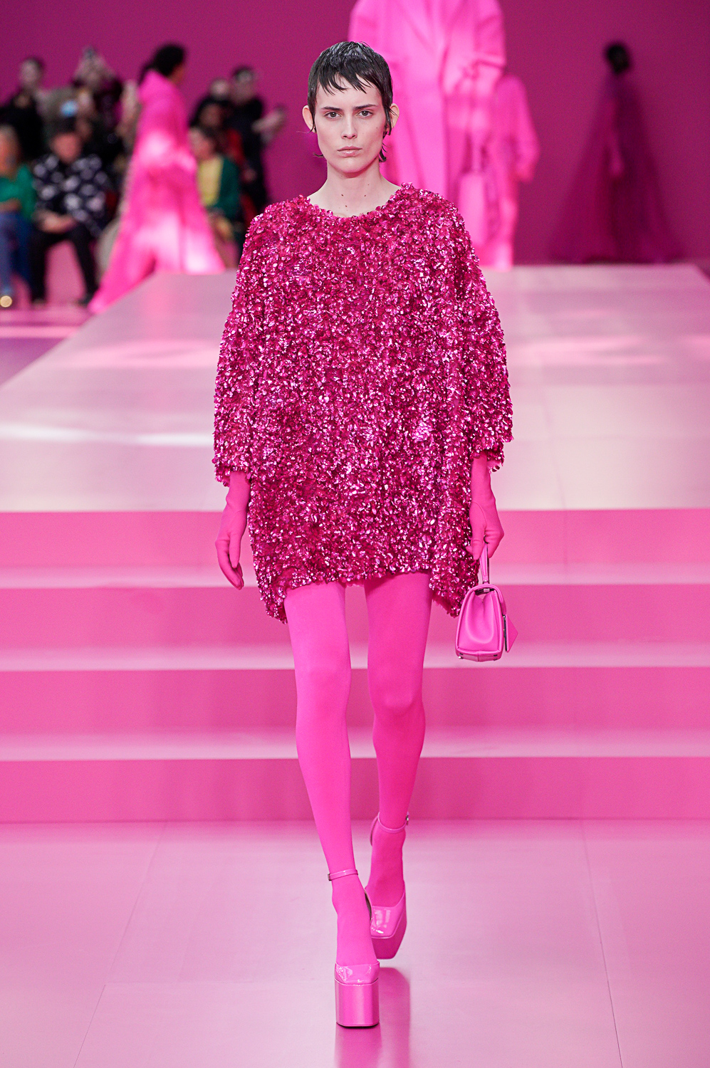
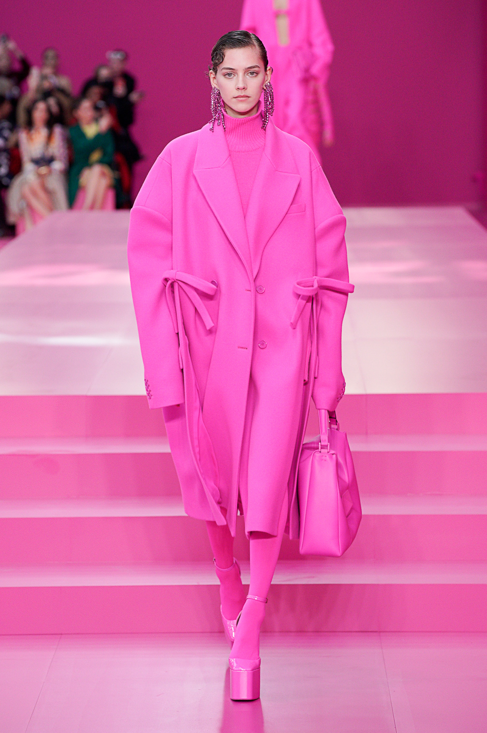
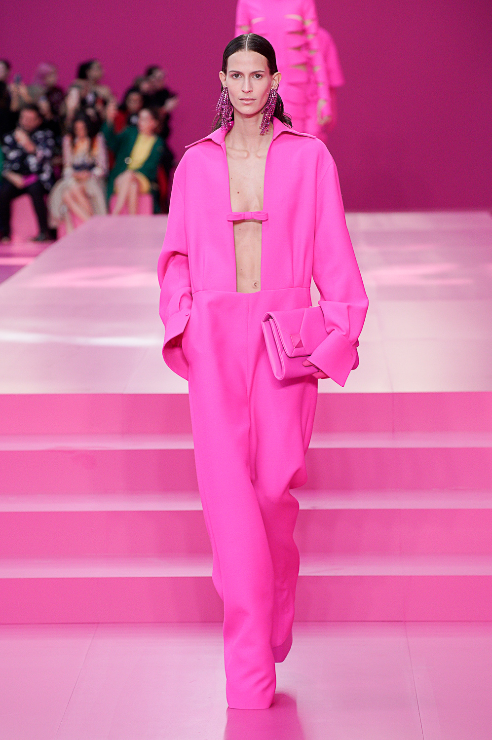
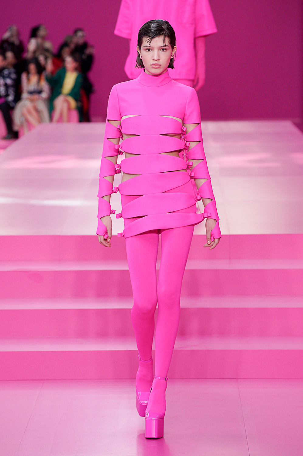
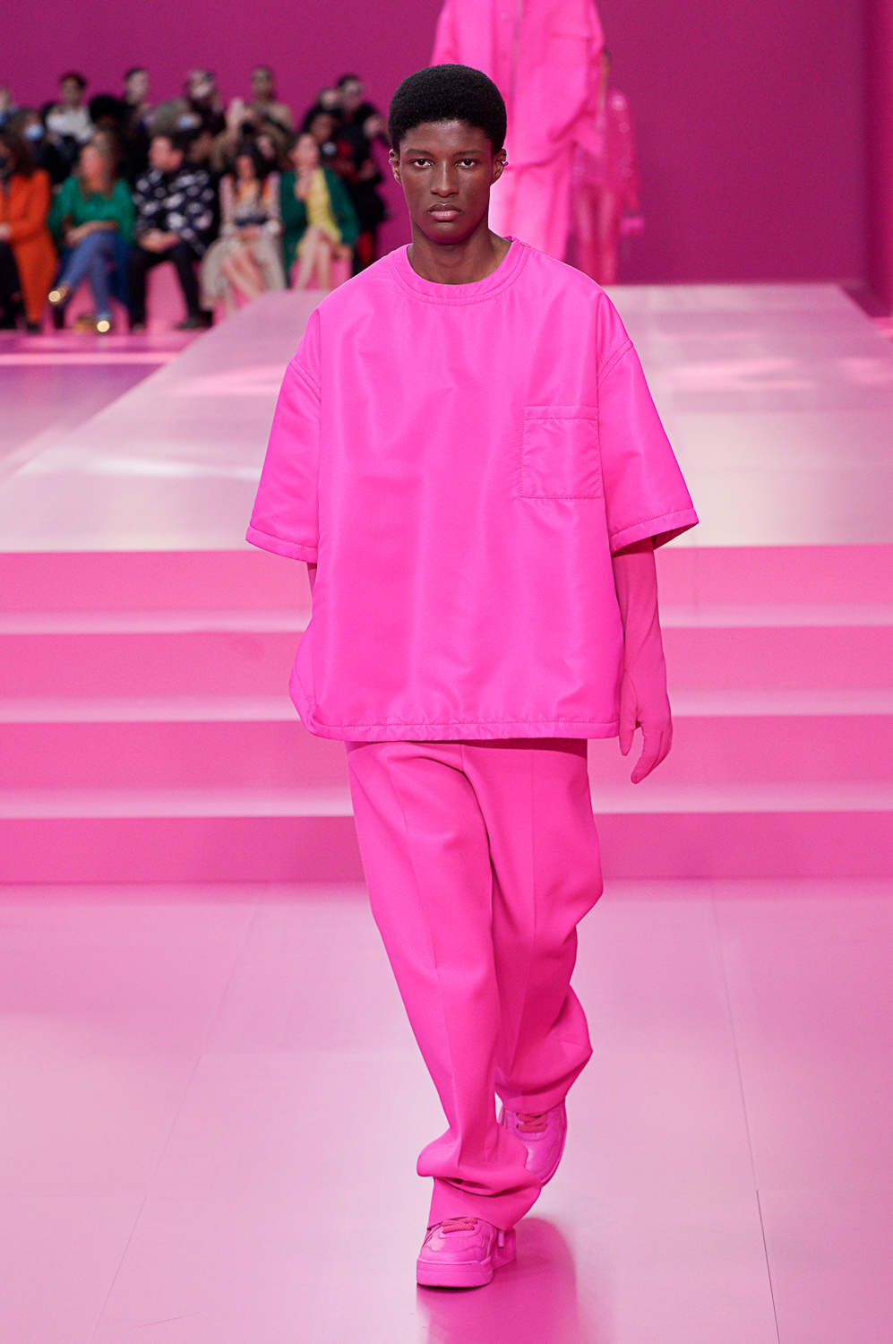
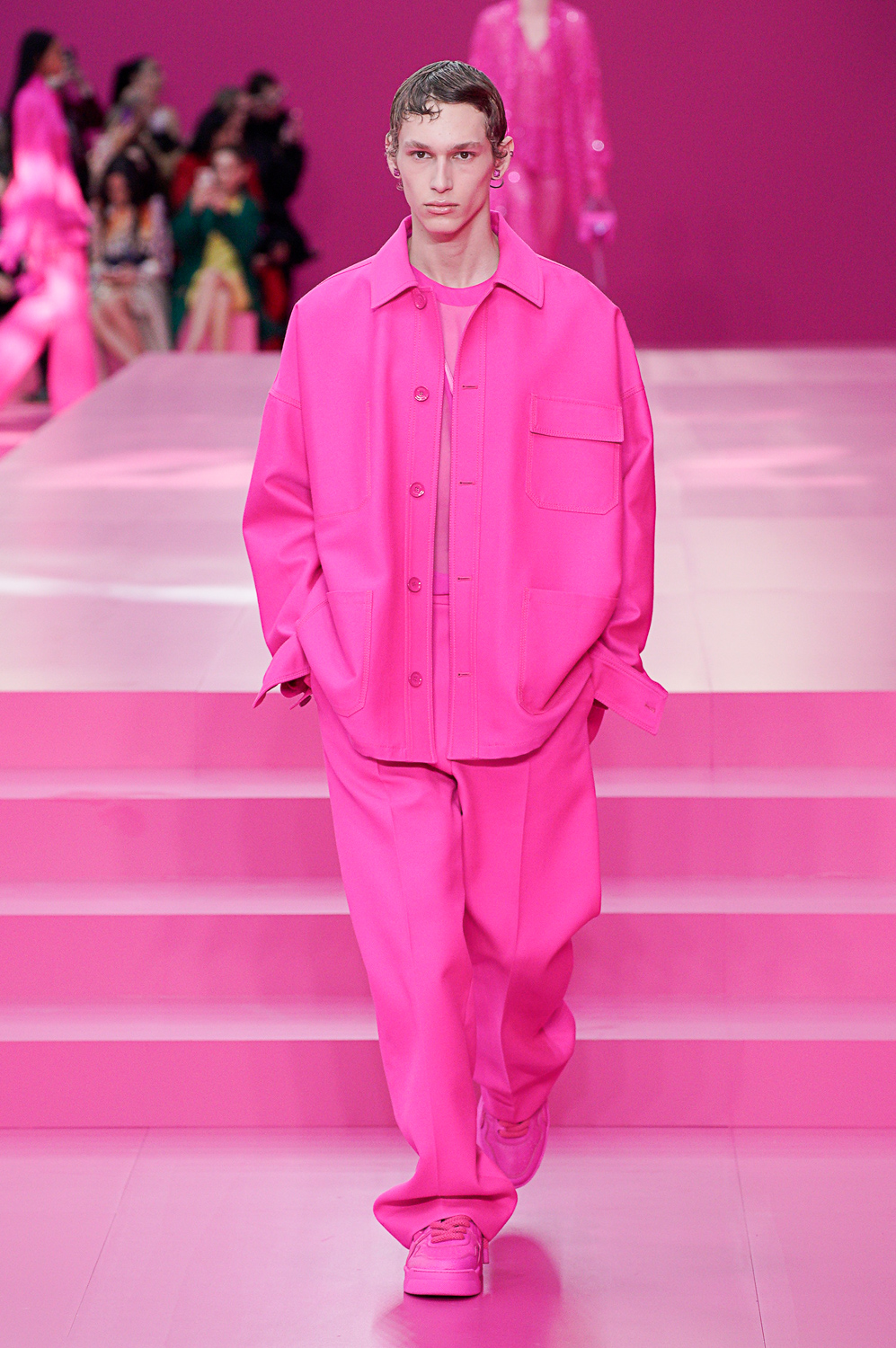
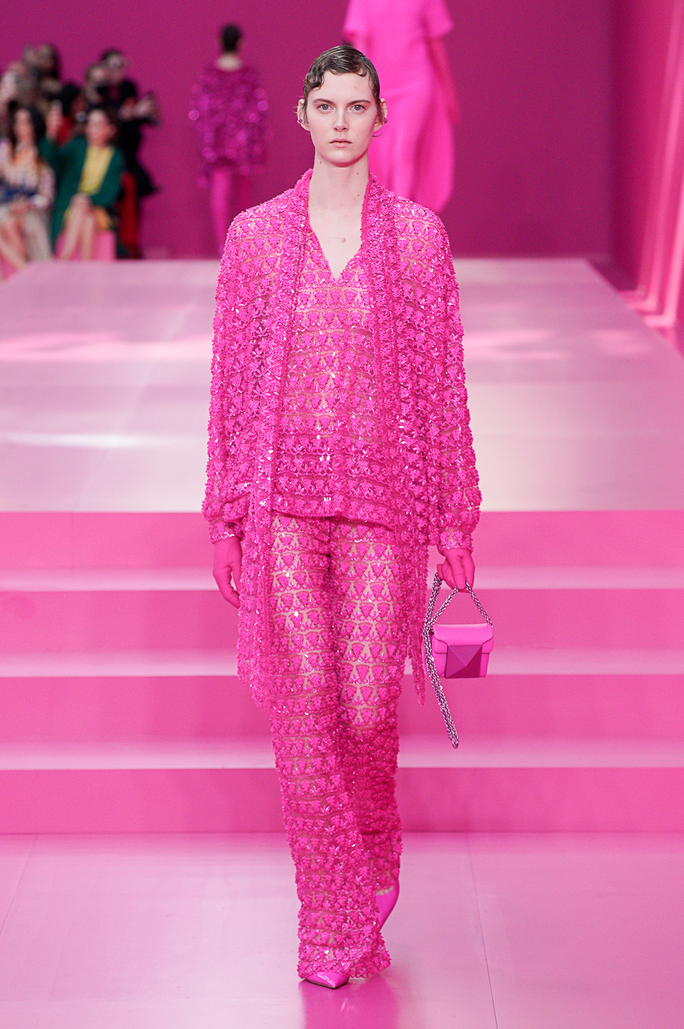
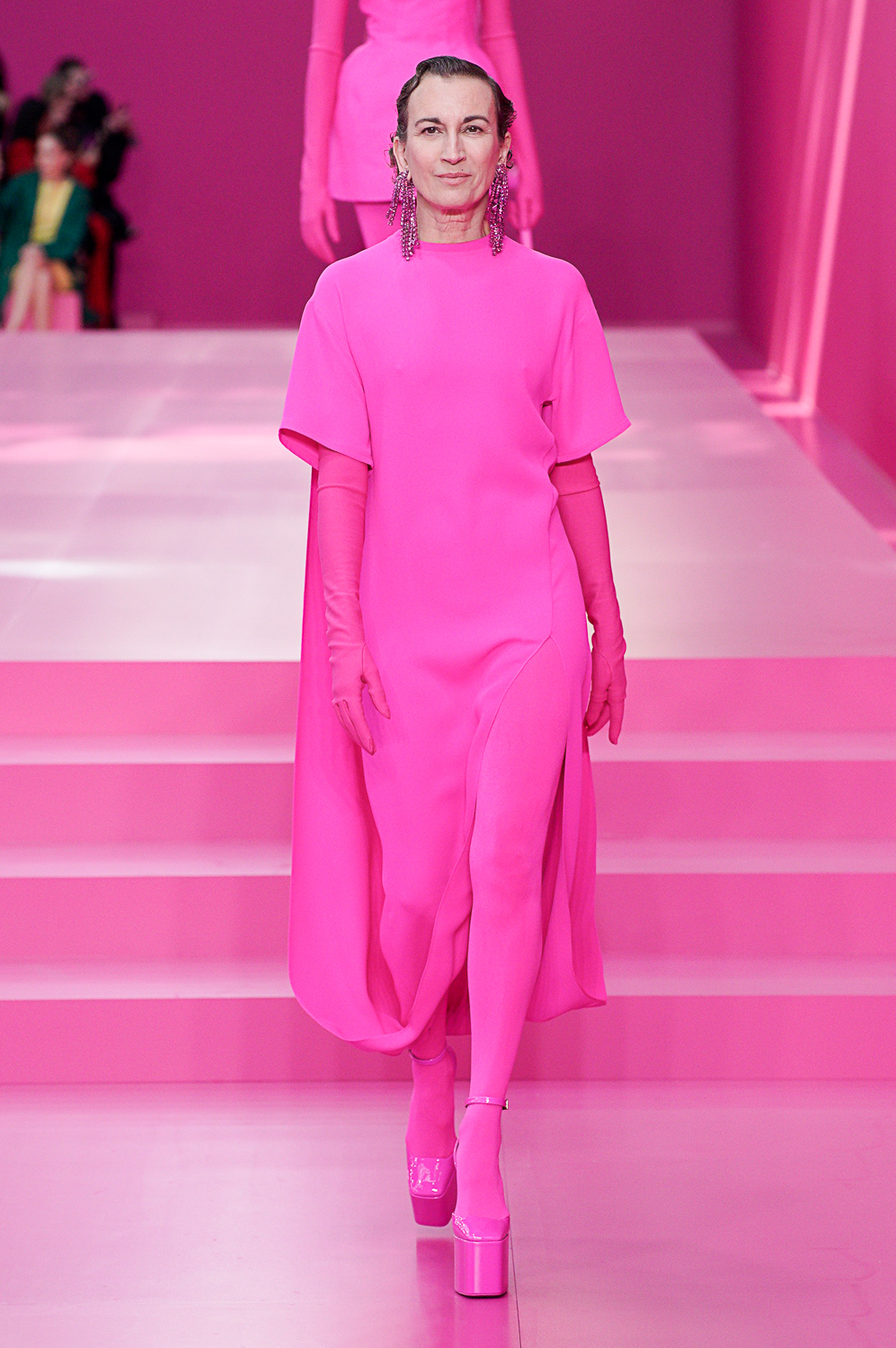
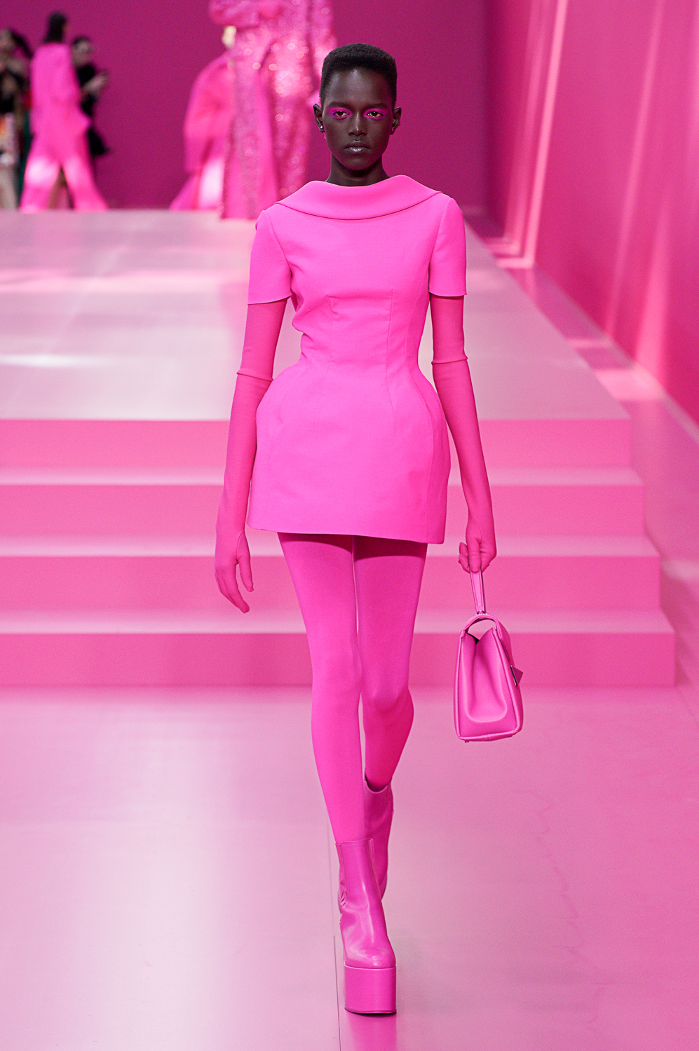
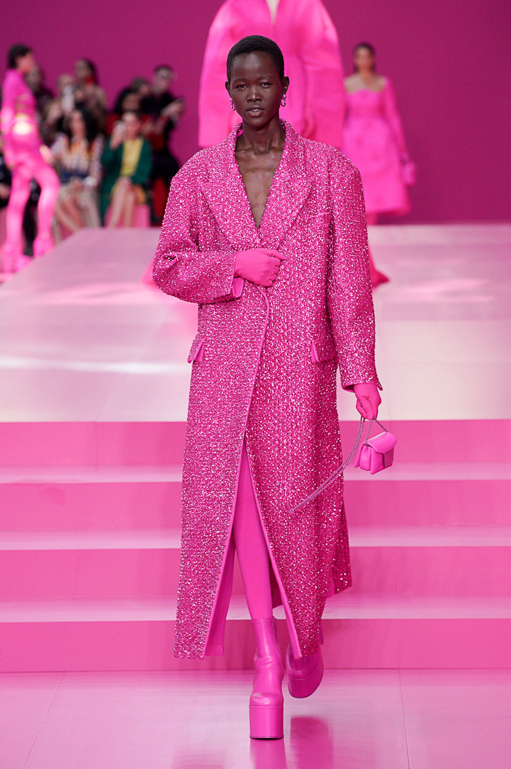
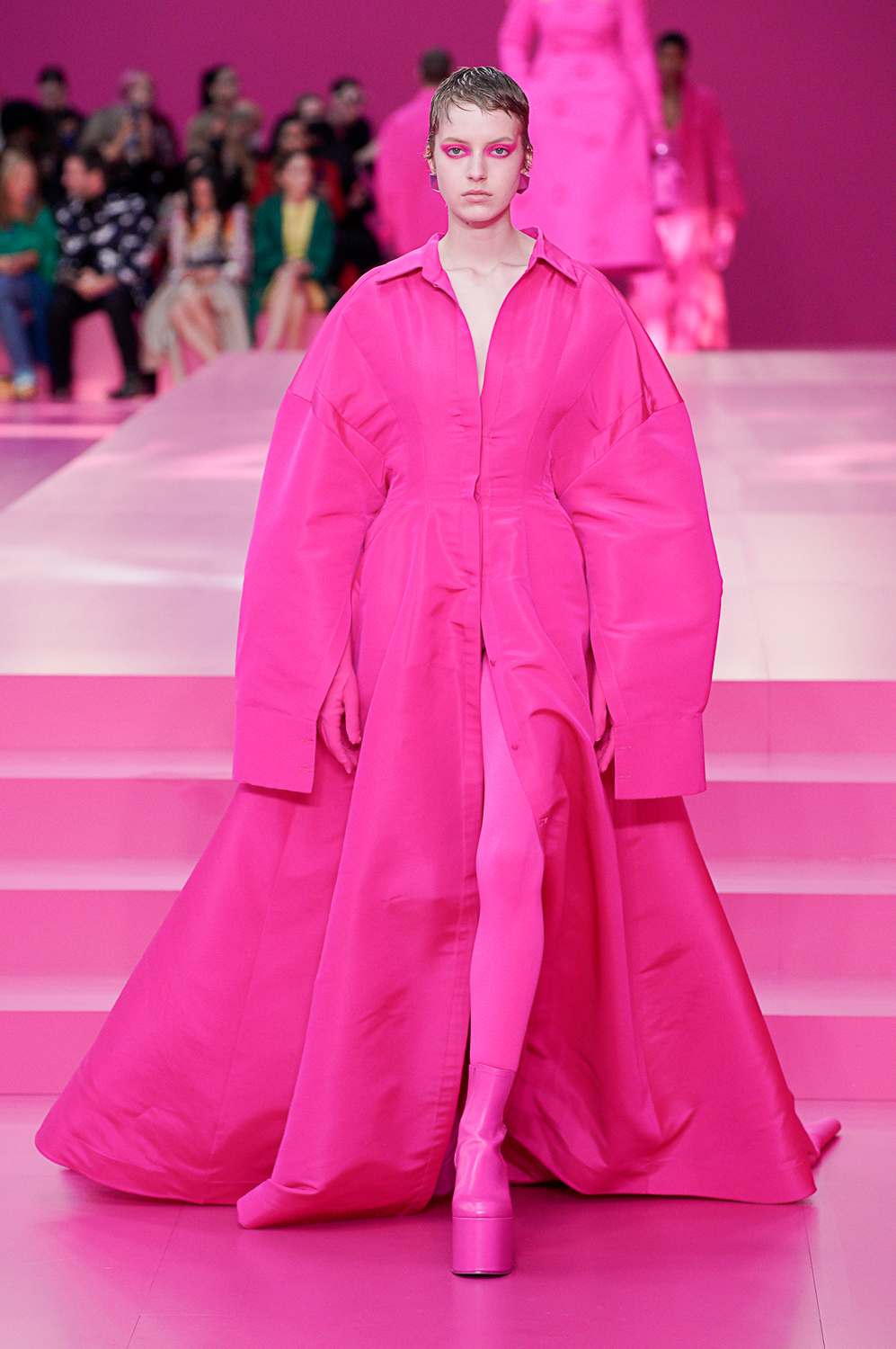
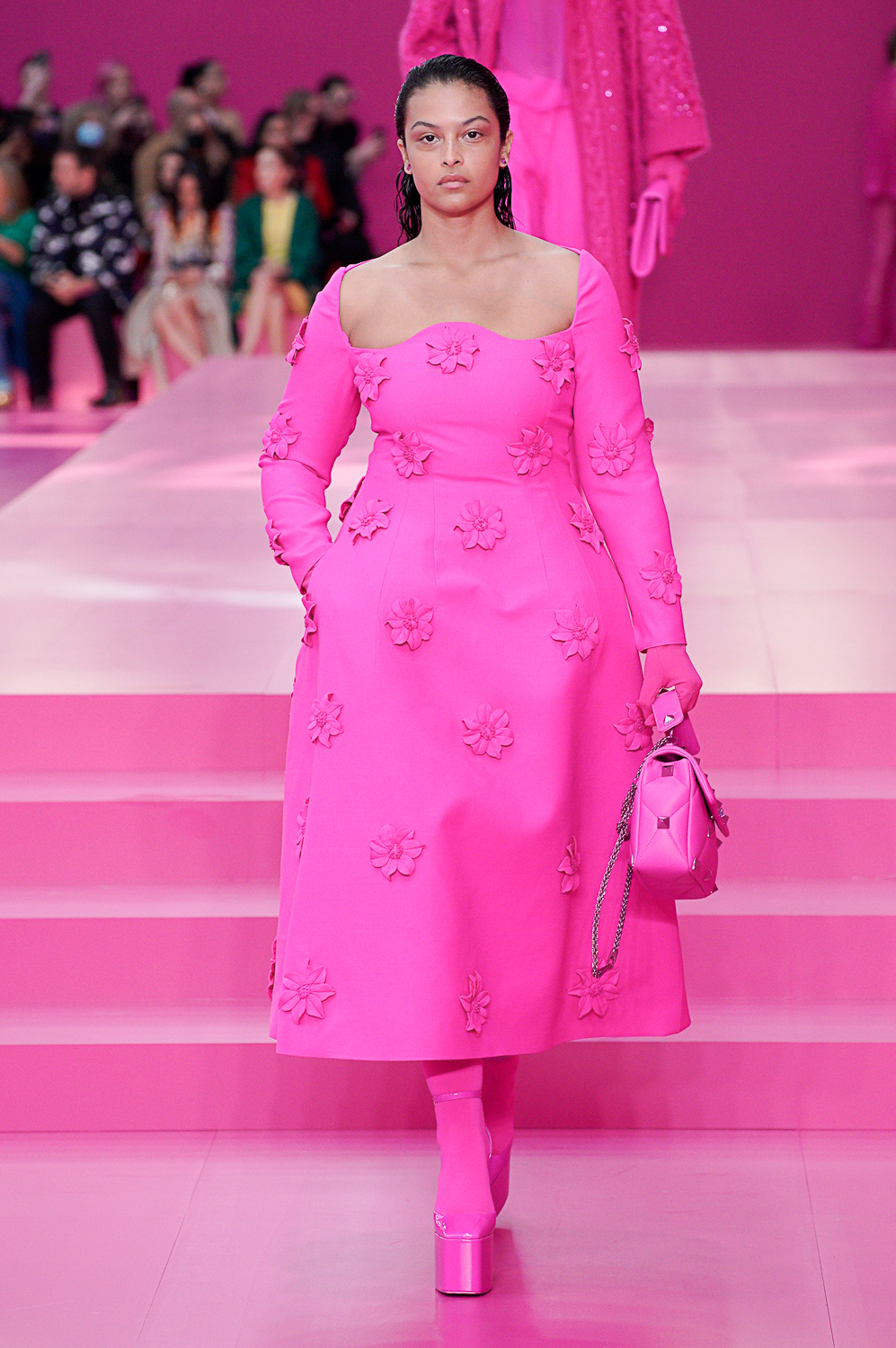
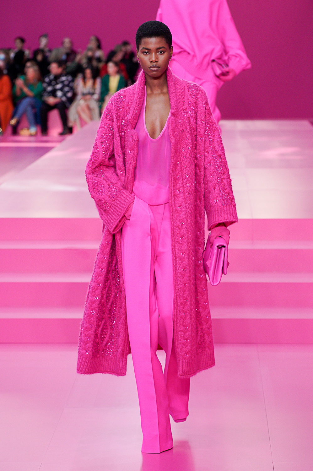
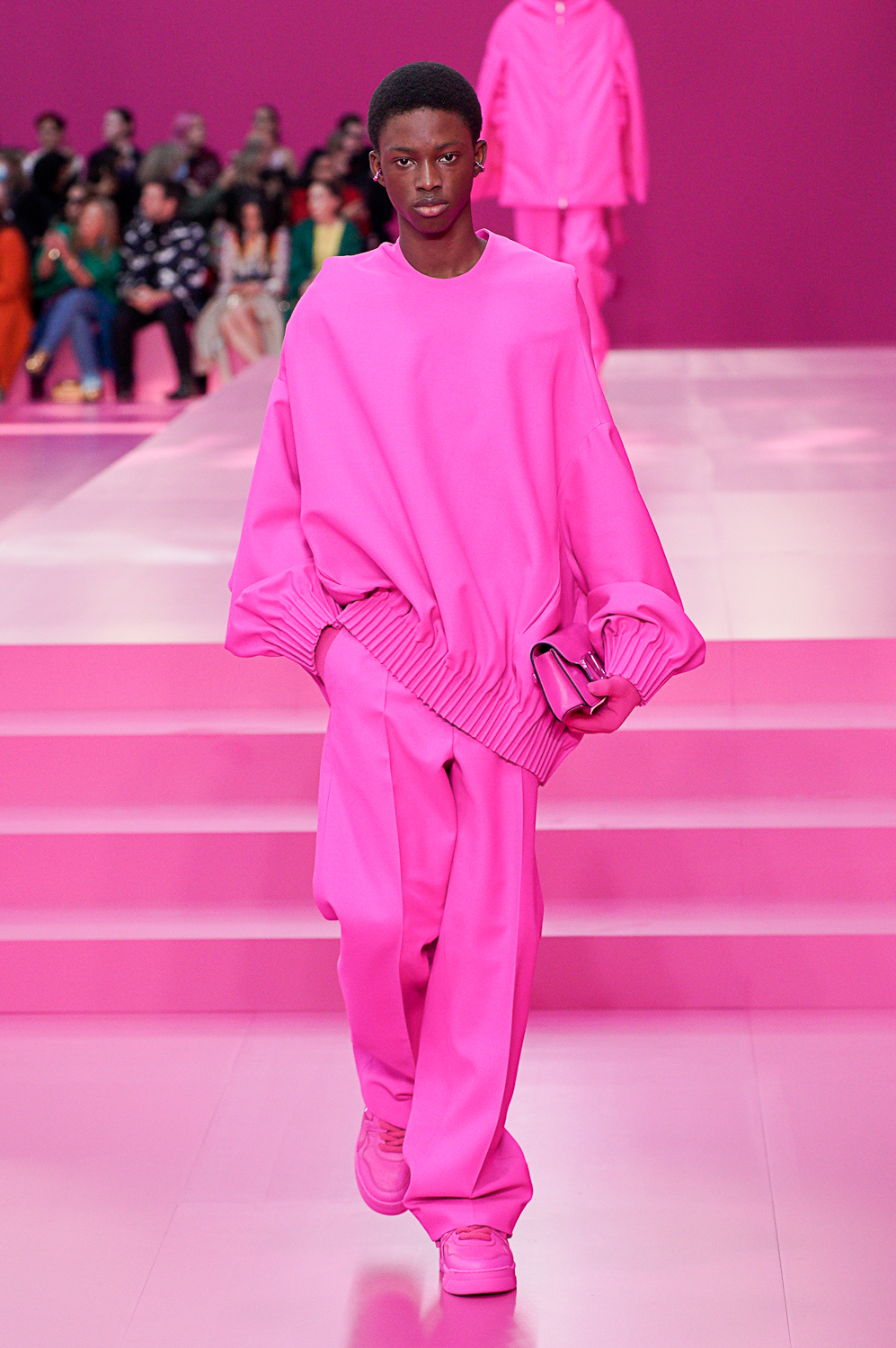
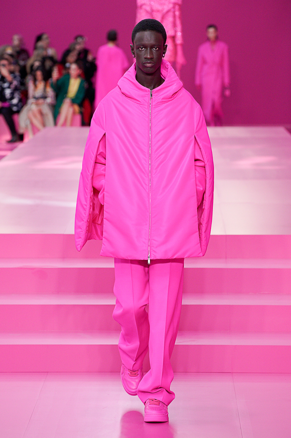
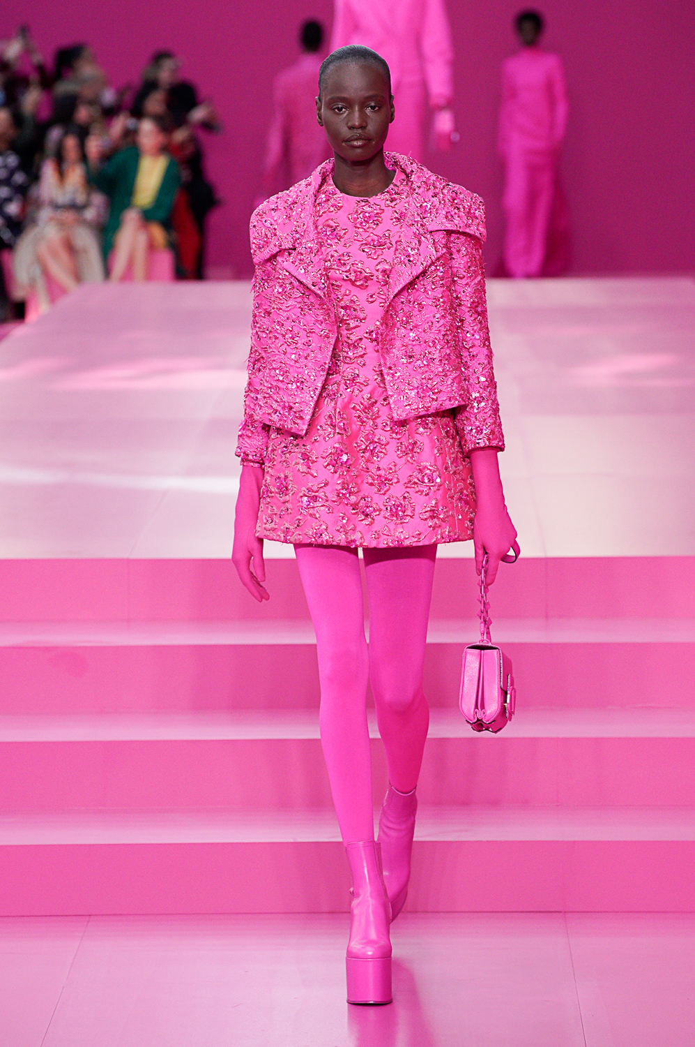
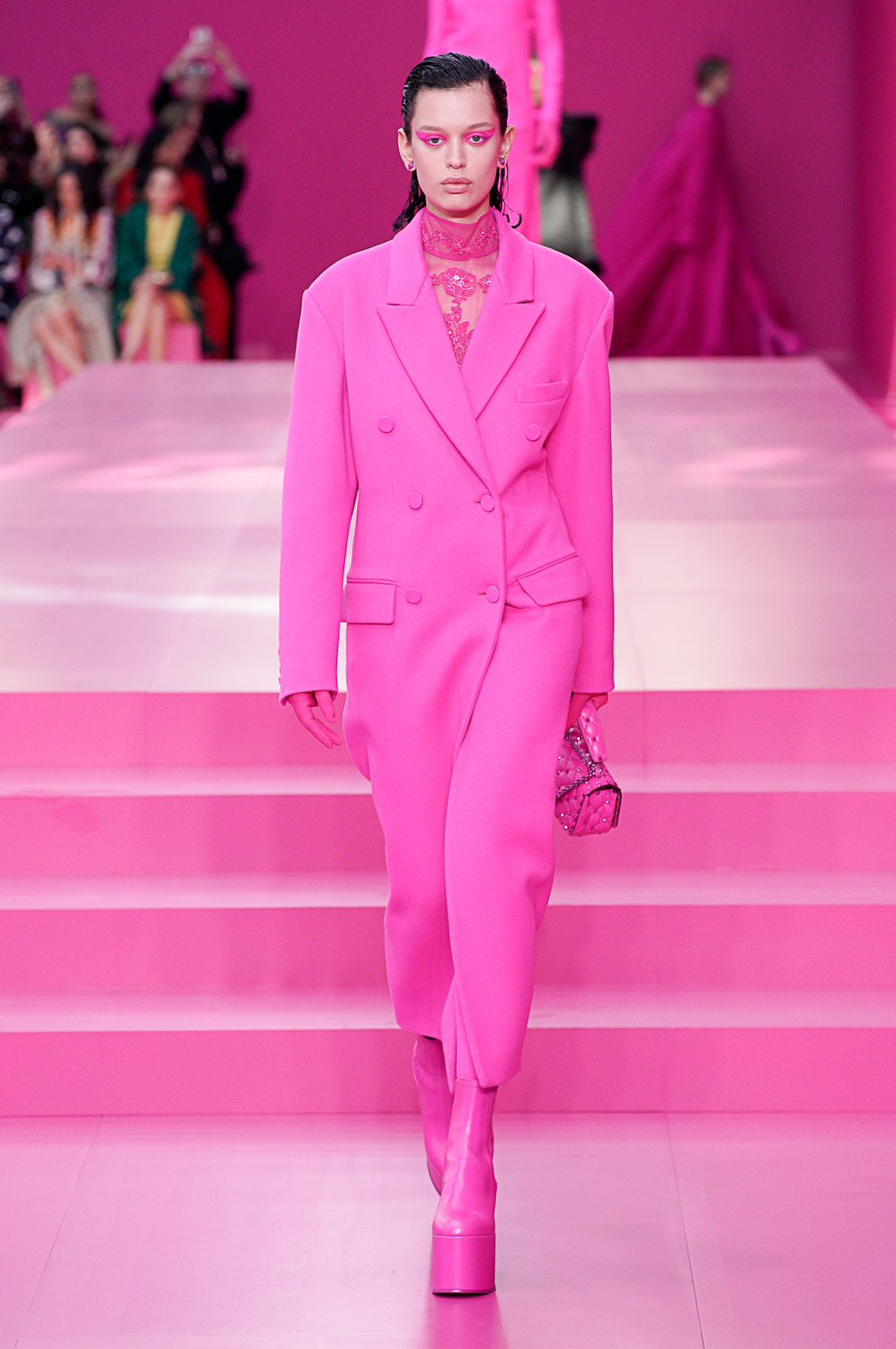
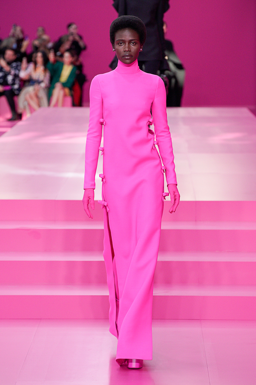
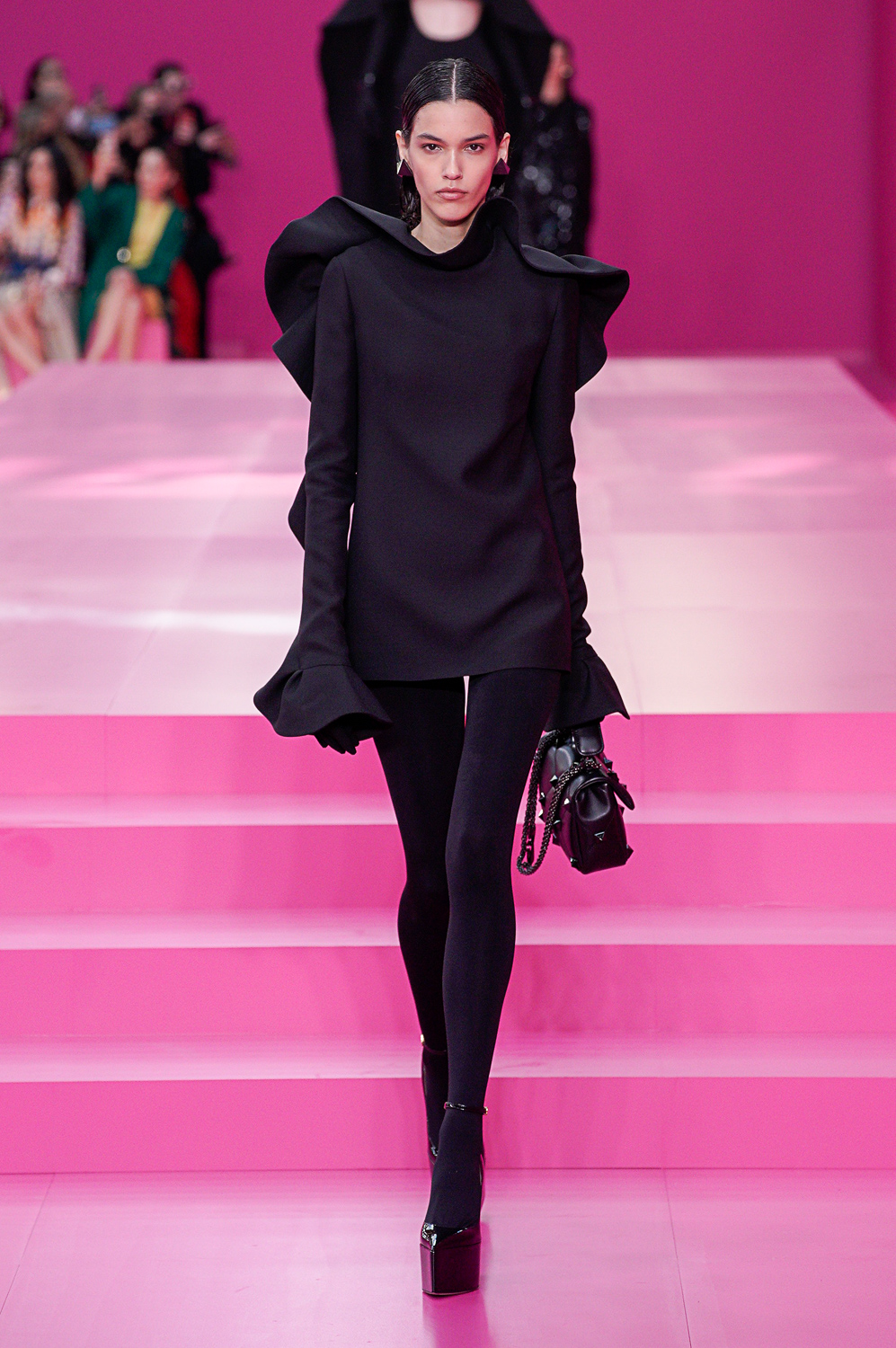
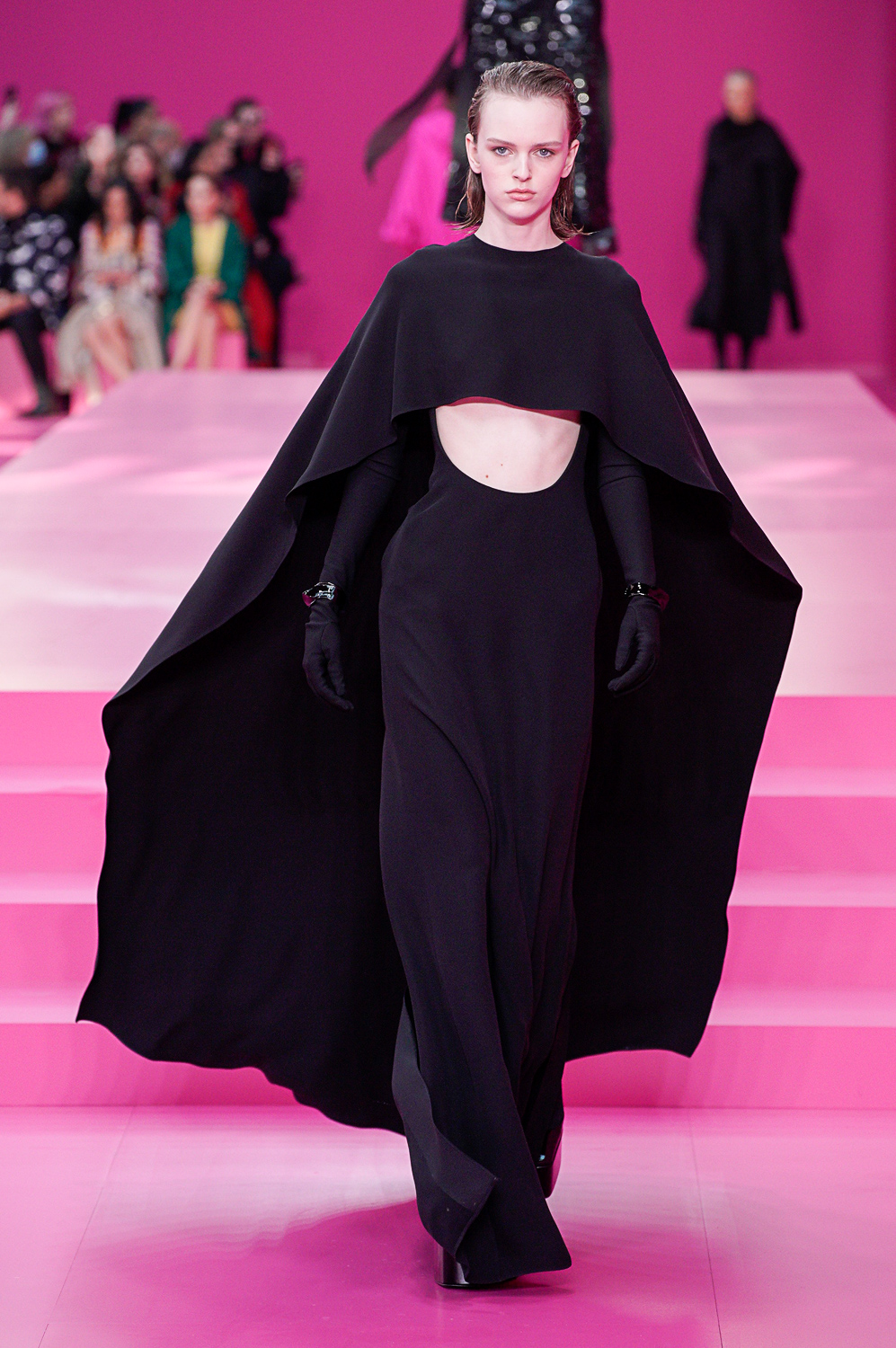
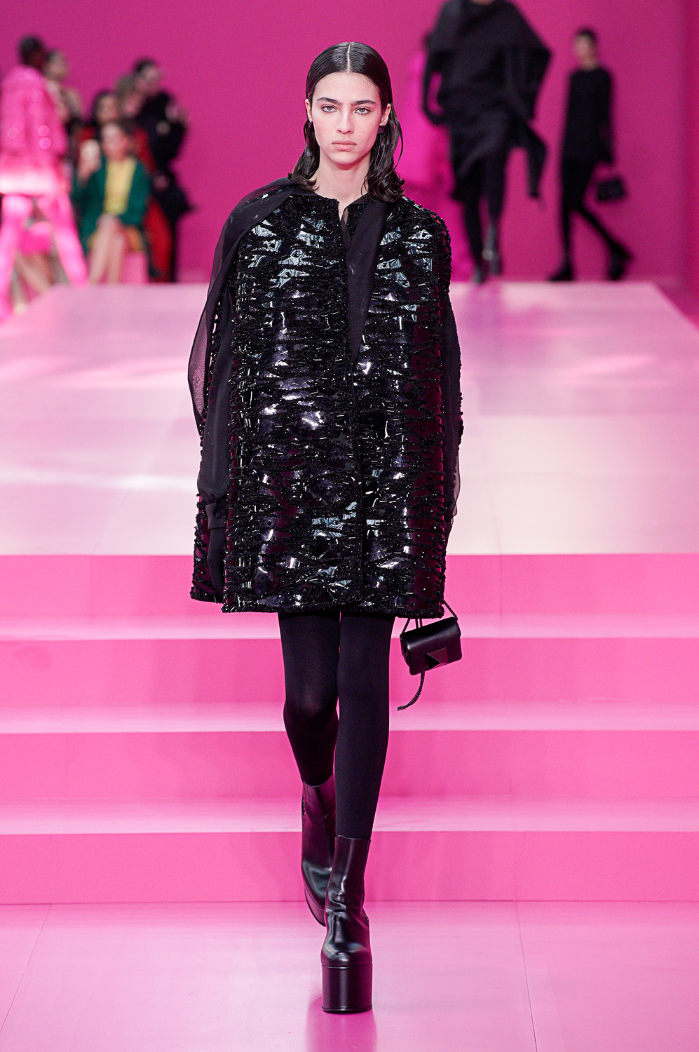
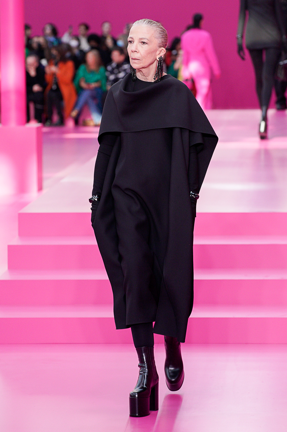
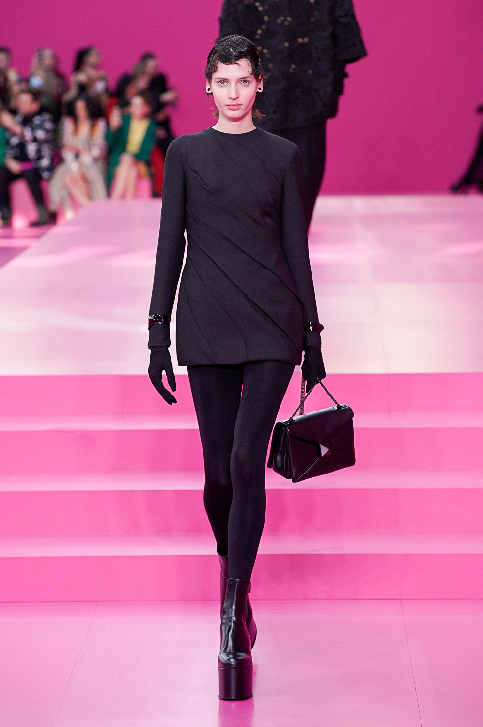
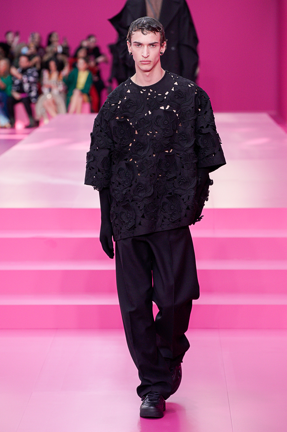
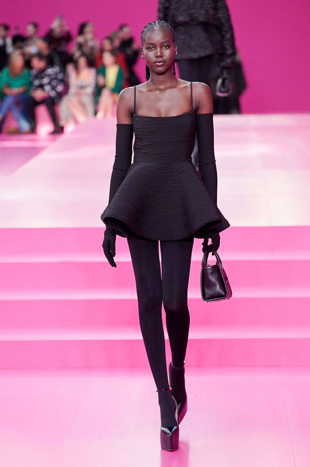
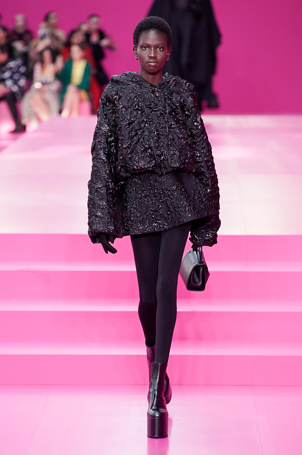
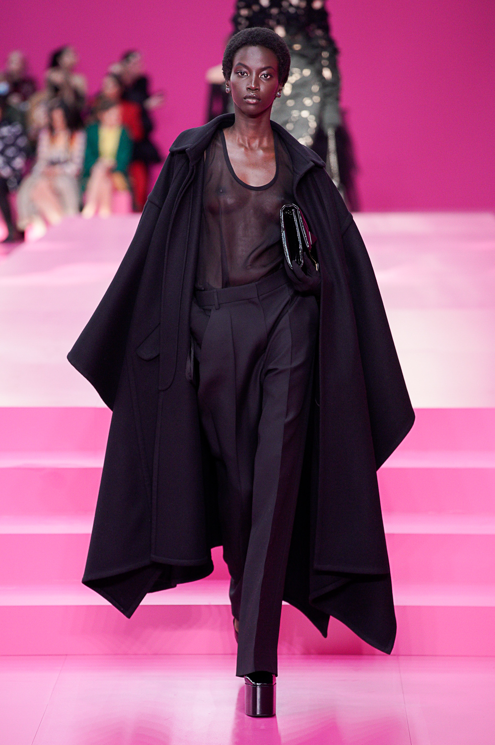
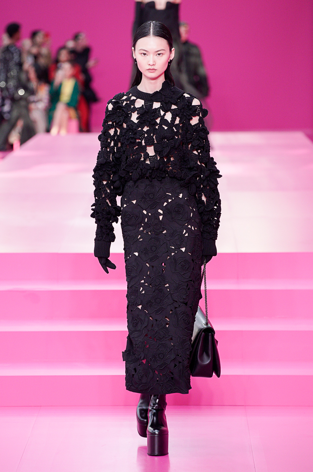
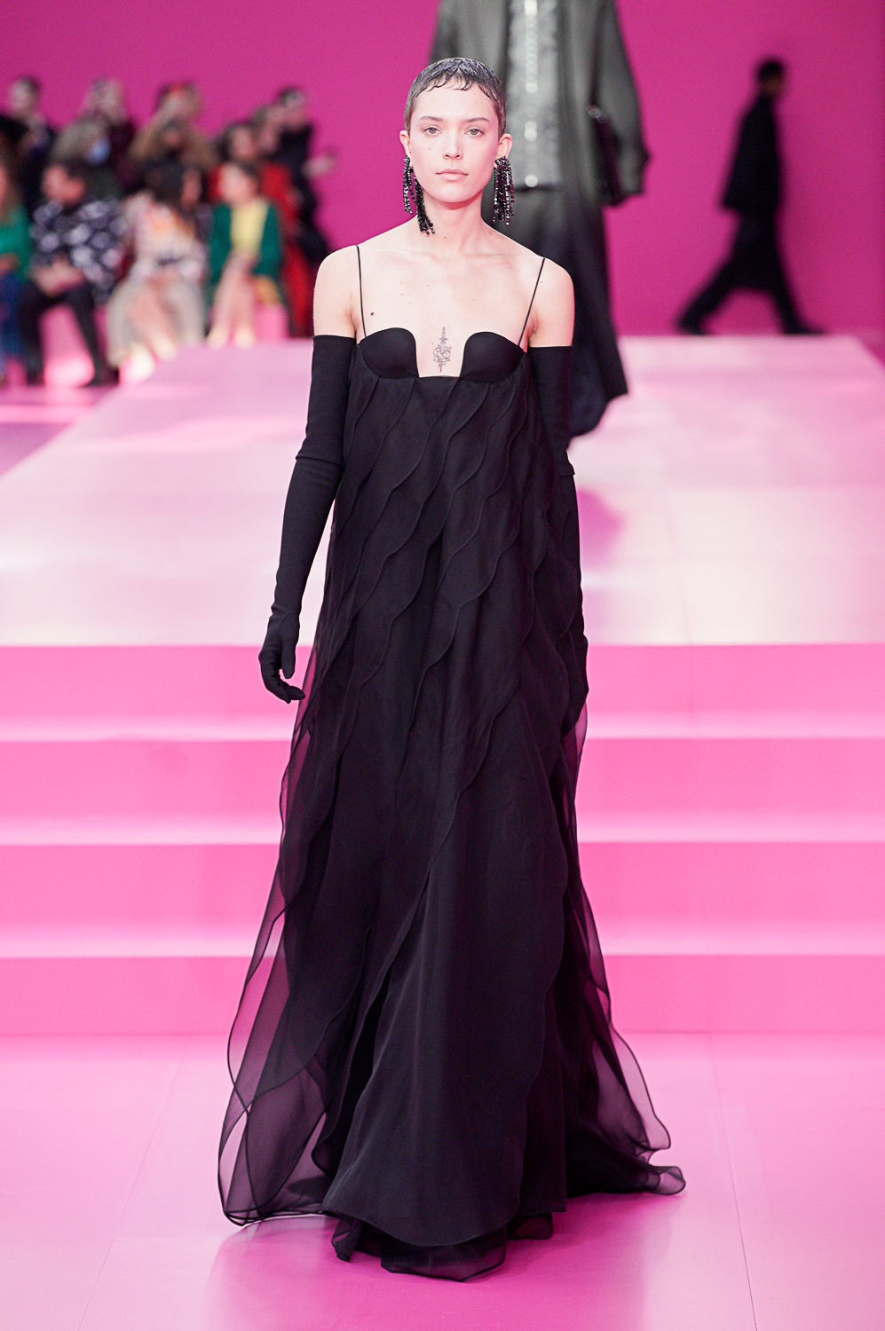
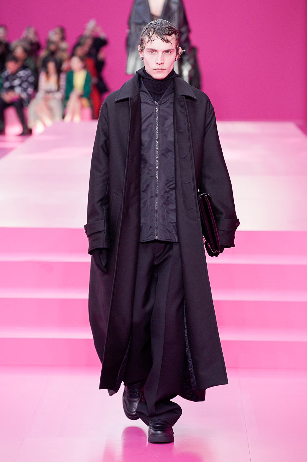
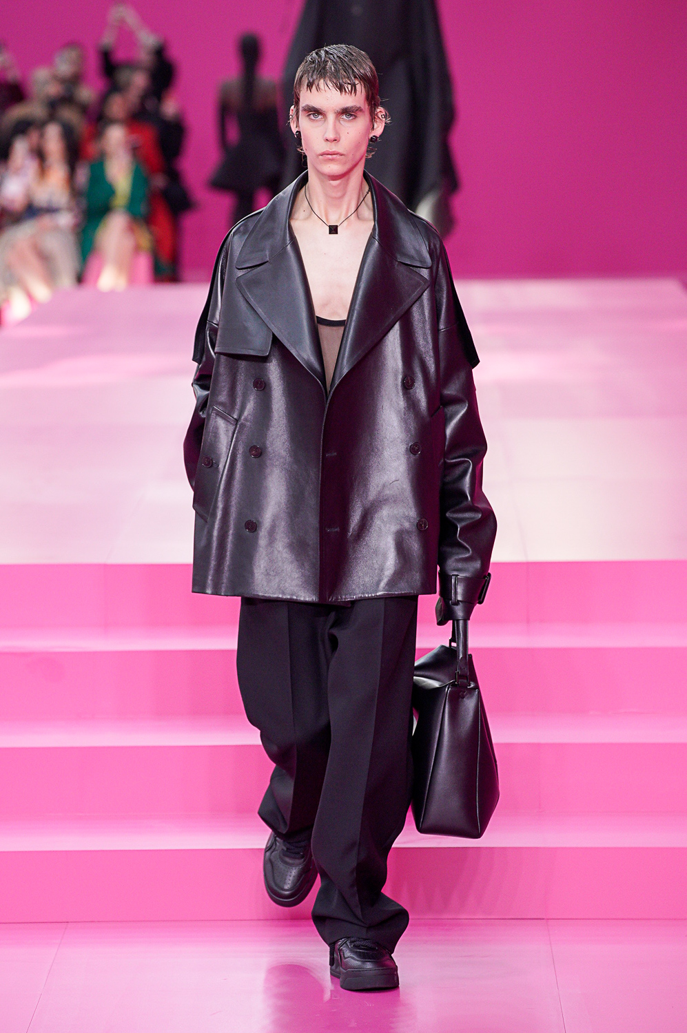
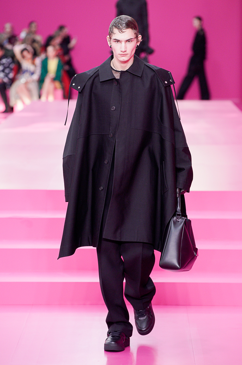
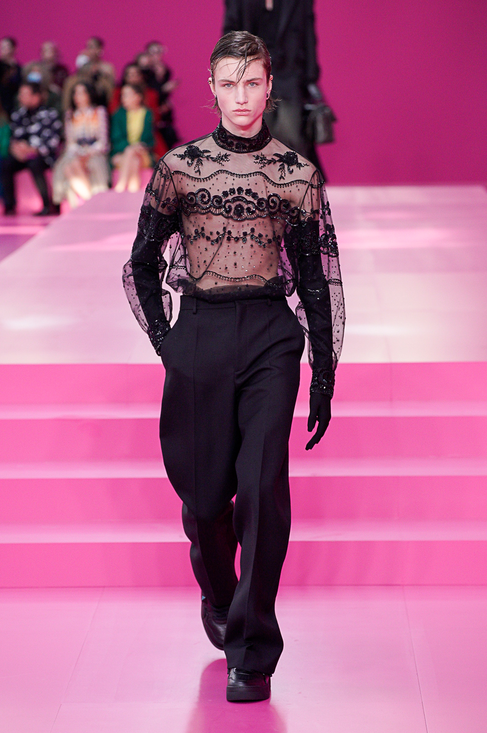
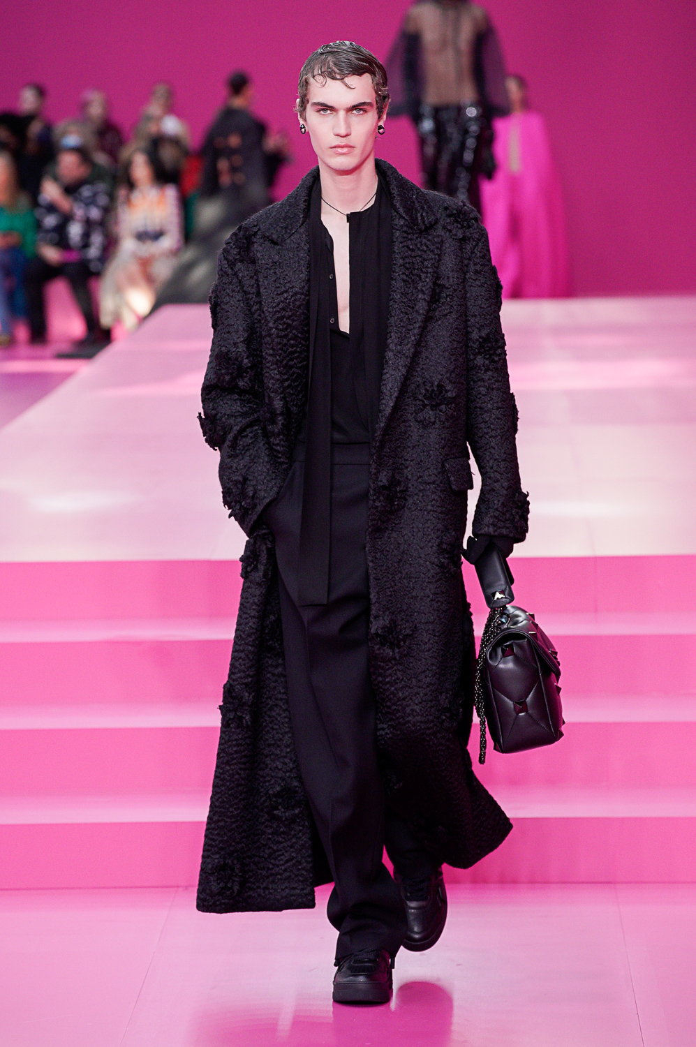
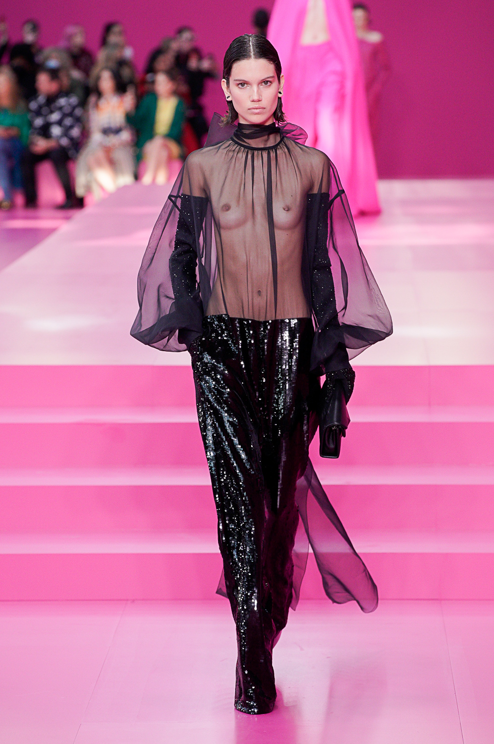
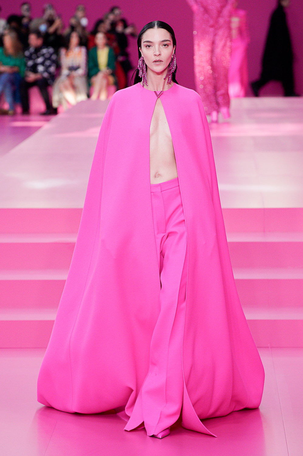
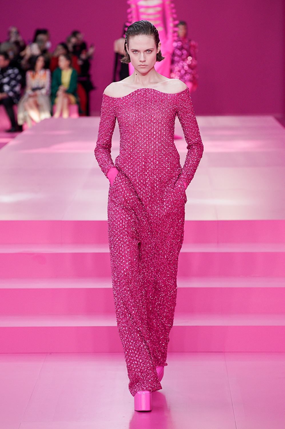
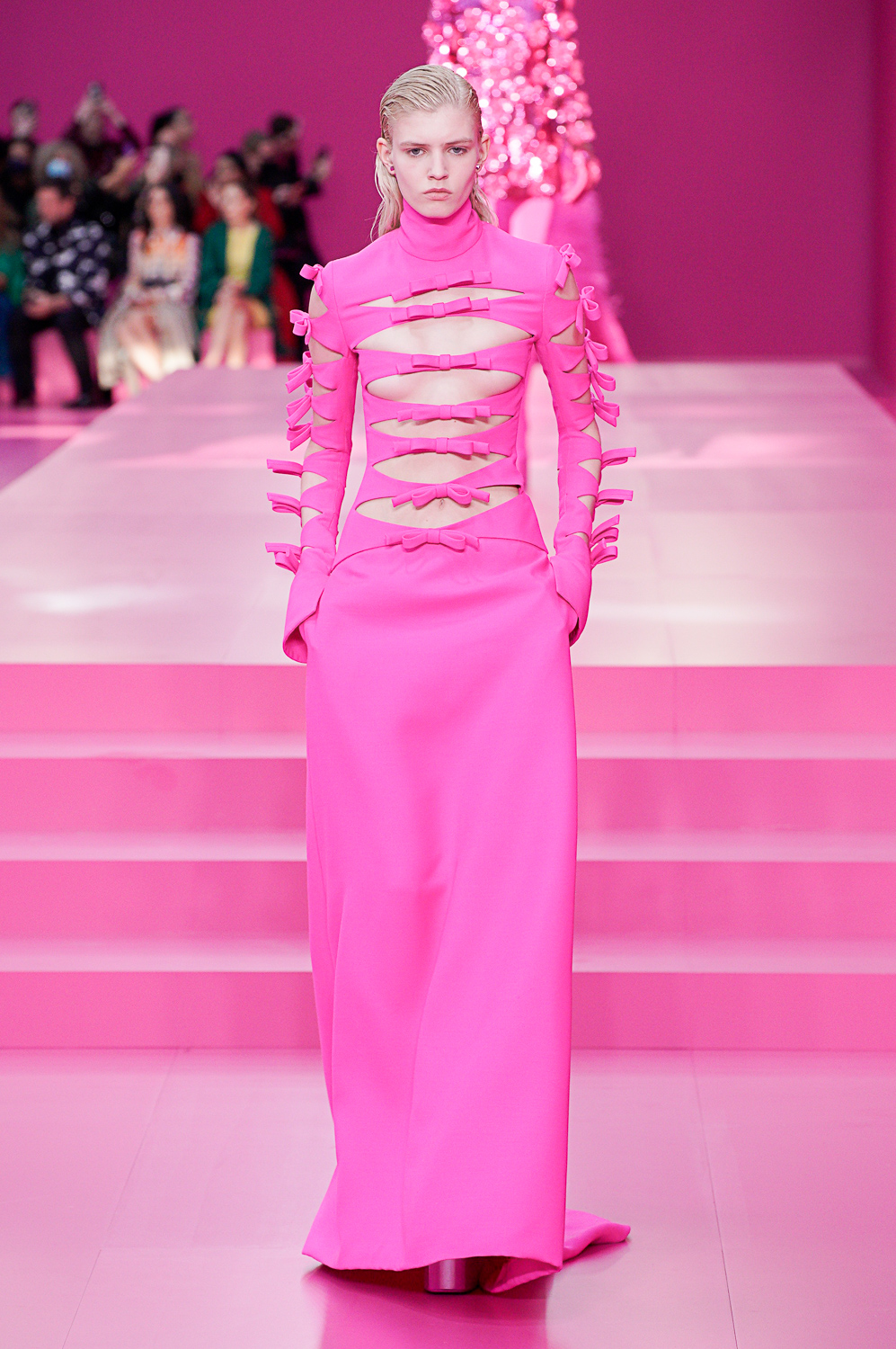
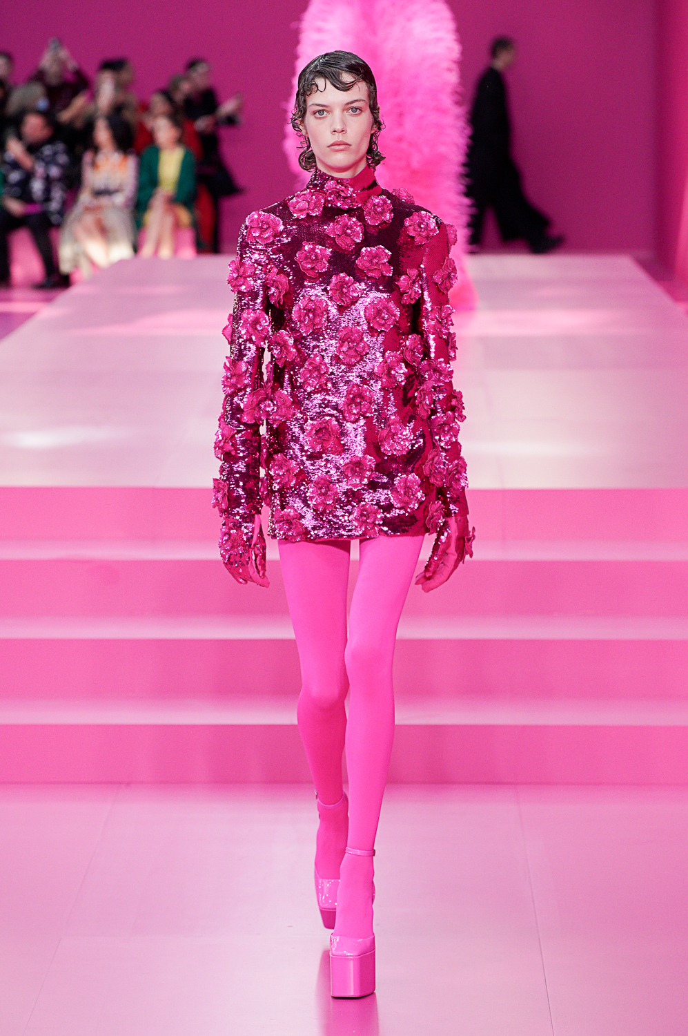
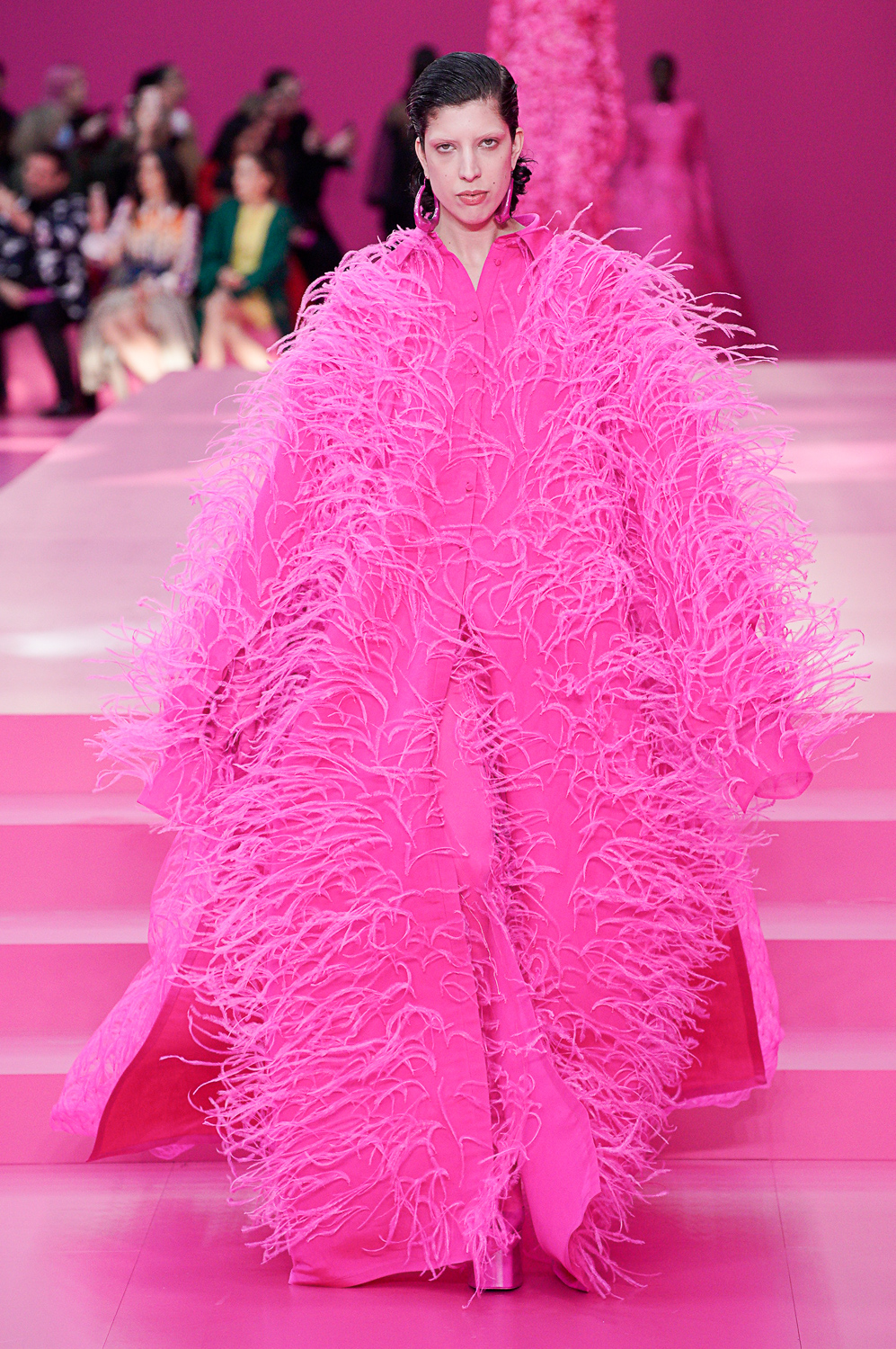
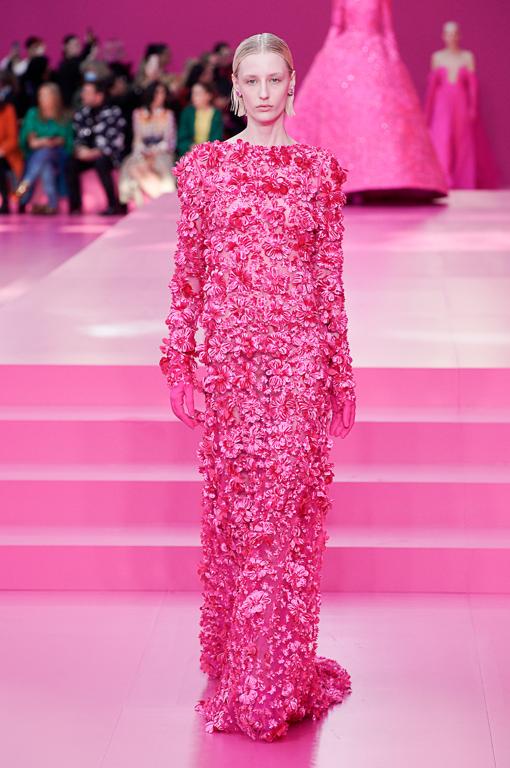
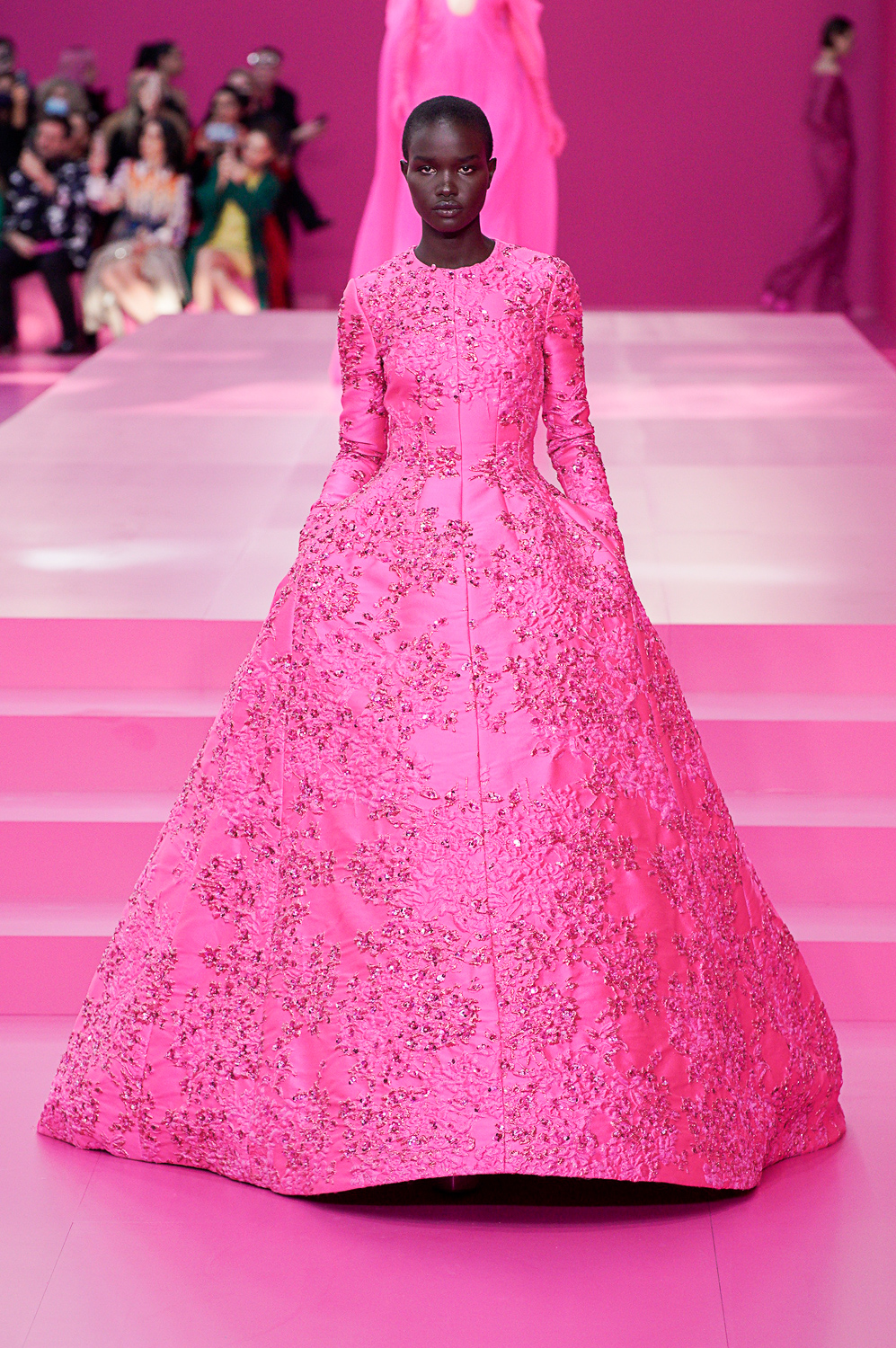
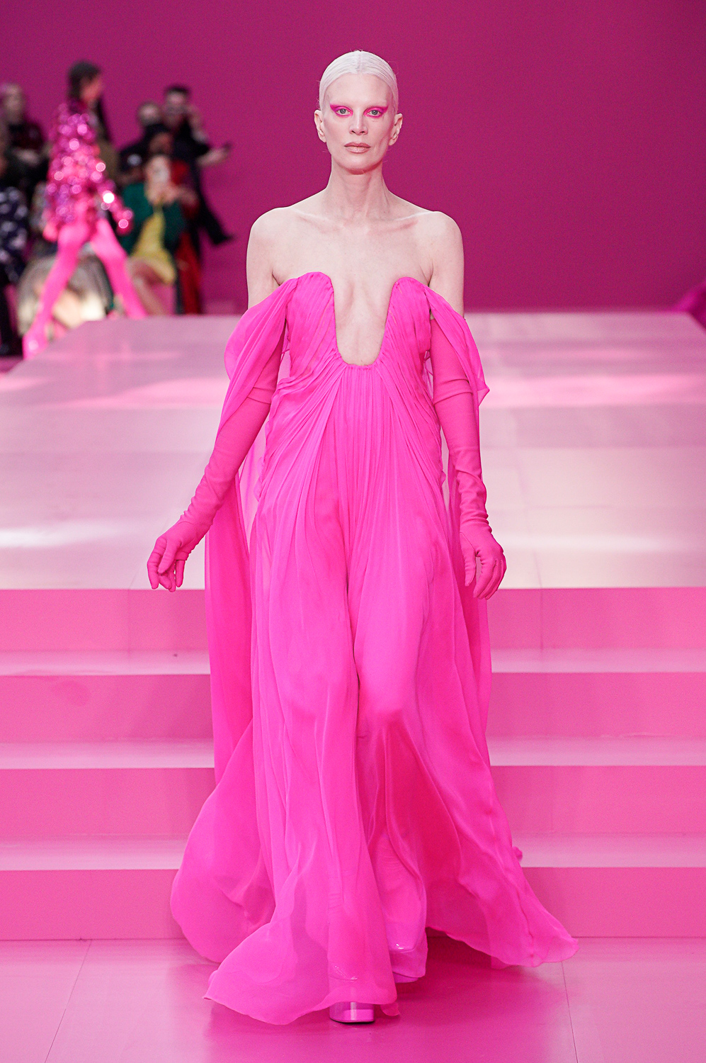
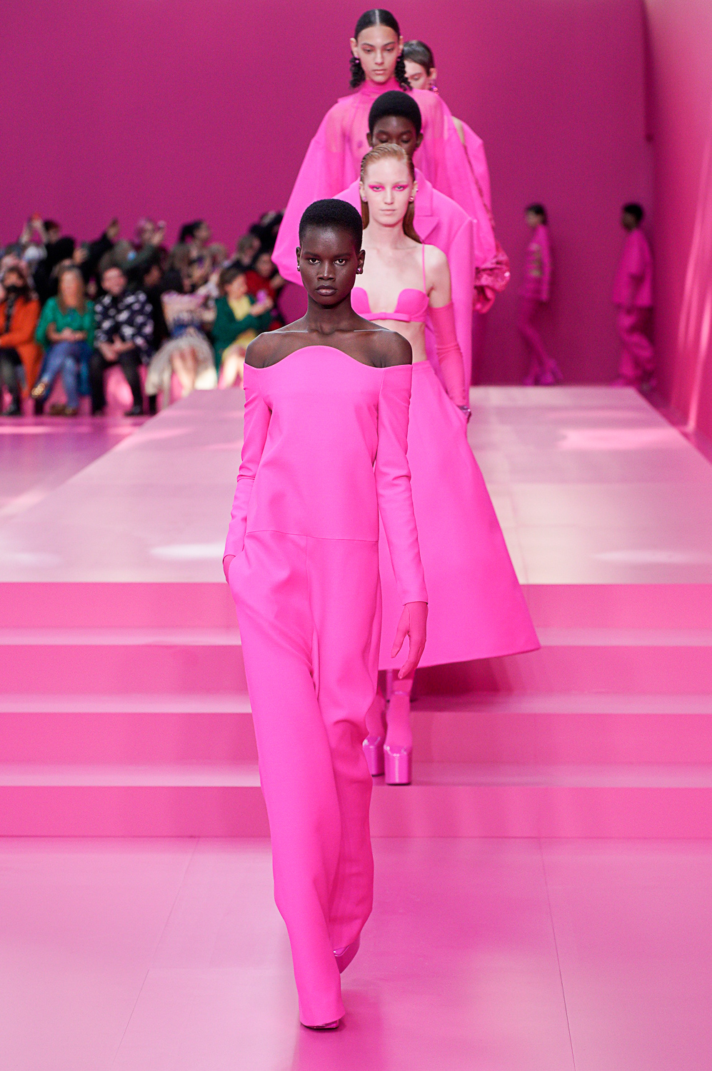
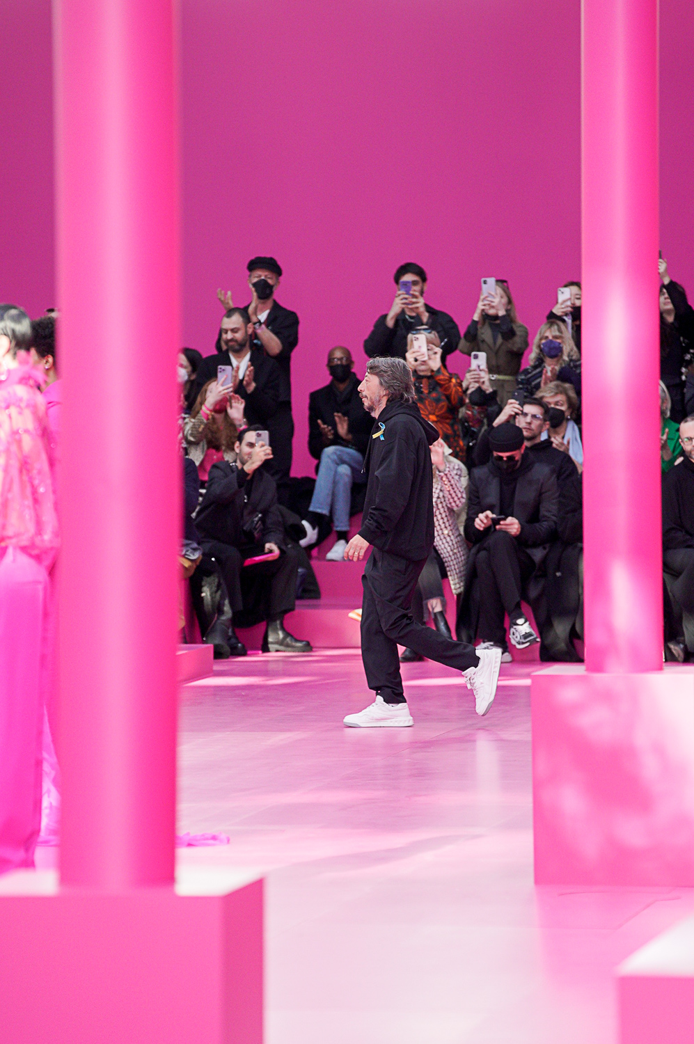
Pierpaolo Piccioli adopted an extreme color strategy for Valentino fall ready-to-wear. Every look on his runway was pink—a specifically vivid tone of retina-vibrating fuchsia, set included. Or it was black.
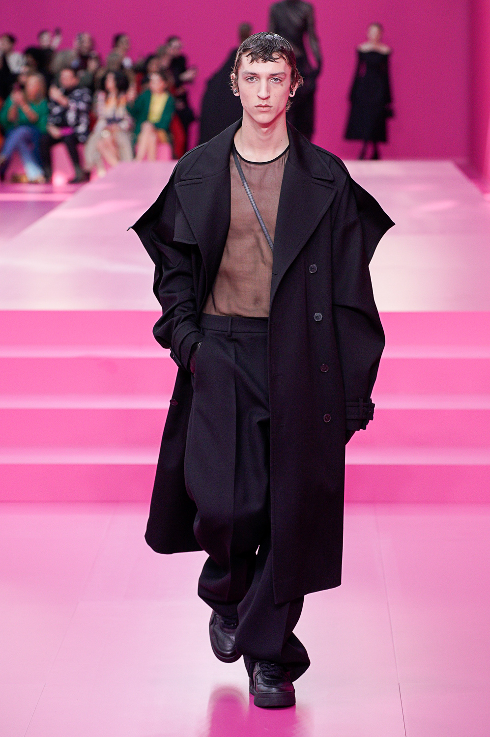
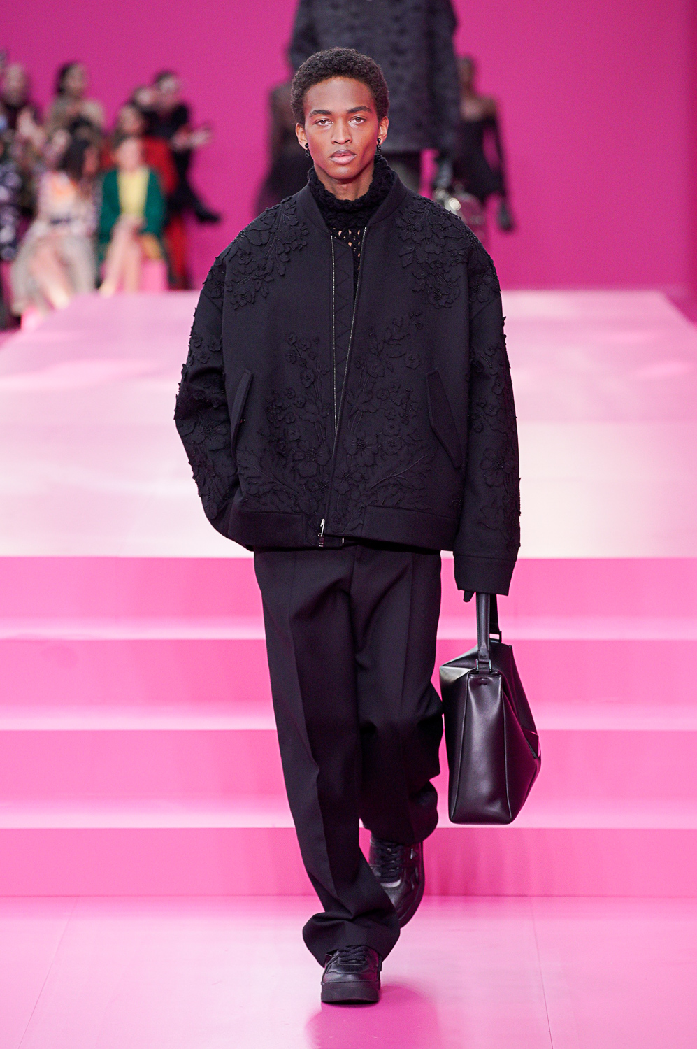
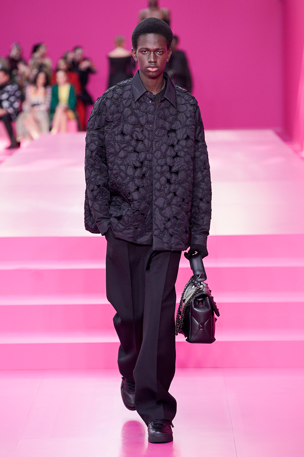
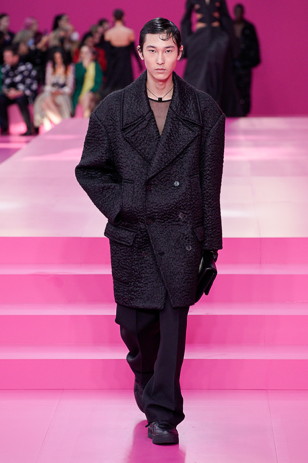
He said he’d chosen what he called “monotone” to remove distractions and concentrate the viewers’ eyes on distinguishing the differences between silhouette and detail. That theory played out in a huge collection of 81 looks, bulked out by the fact that he was showing menswear alongside women.
Pink, though? Piccioli claimed he’d selected it—rather than Valentino red, or any other color, to “subvert” its cultural meanings, its associations with girlishness, or punk, or its original one which limited its use to men (presumably to kings, cardinals, and popes in the renaissance). Anyway, those weren’t thoughts which bothered the intellect too much as the visual saturation—a bath in hot, hot pink—continued.
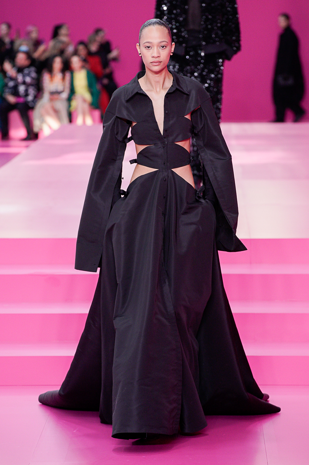
The pink went on for 40 silhouettes, meted out from head to toe (shod in either extremely high platform shoes, or chunky sneakers), in everything from tiny bubble dresses to long, narrow tabards, to crinolined bells; from sweeping opera coats to tailored suits and overcoats. It then returned eight more times for a grand finale of ostrich feathers, stately capes, and embroidery.
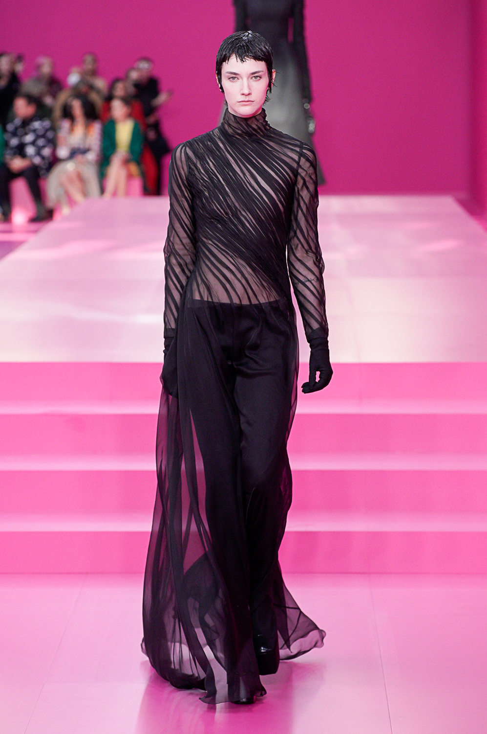
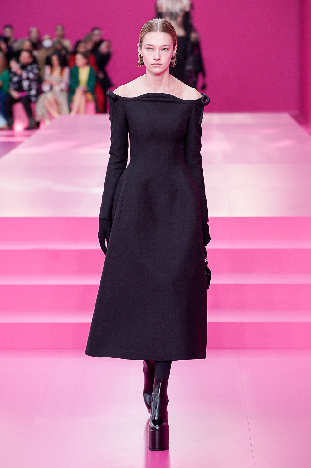
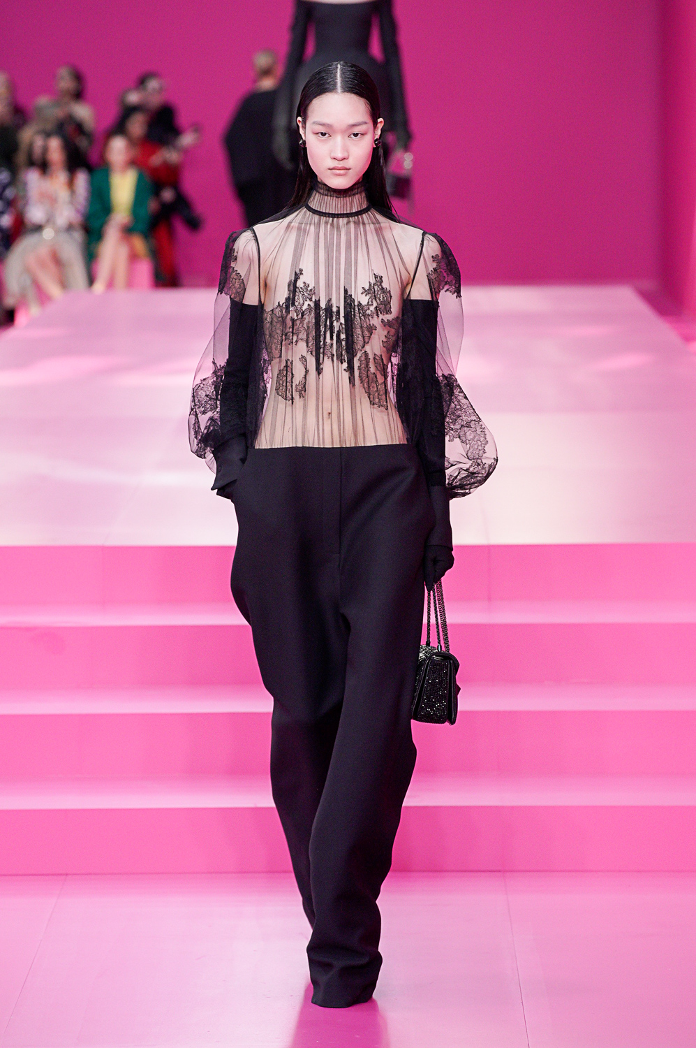
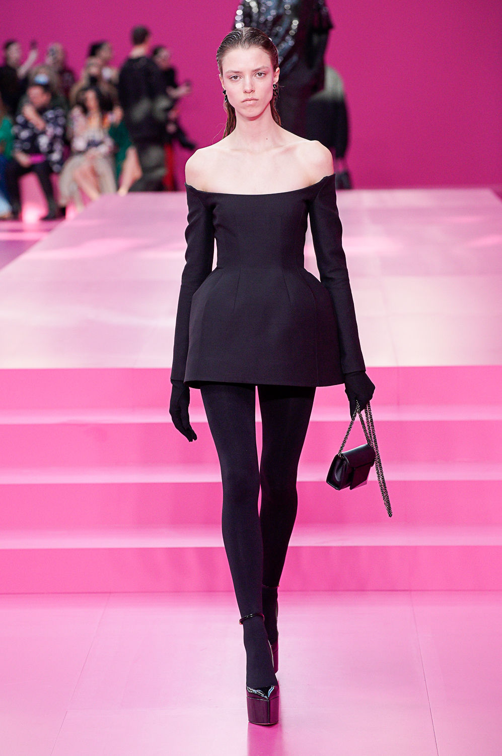
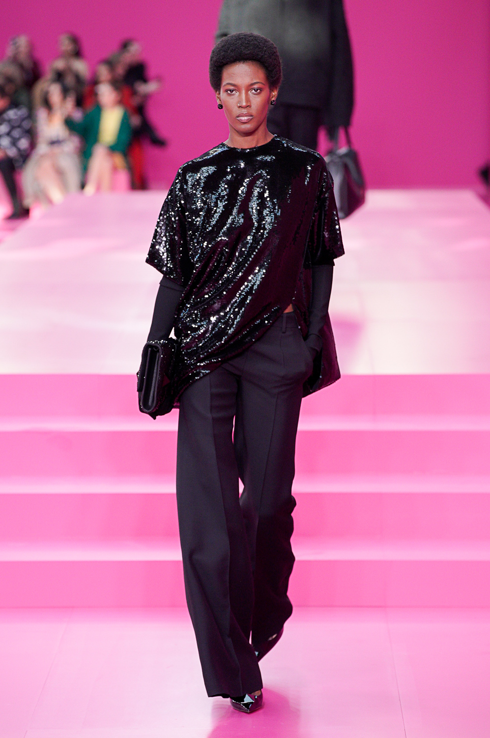
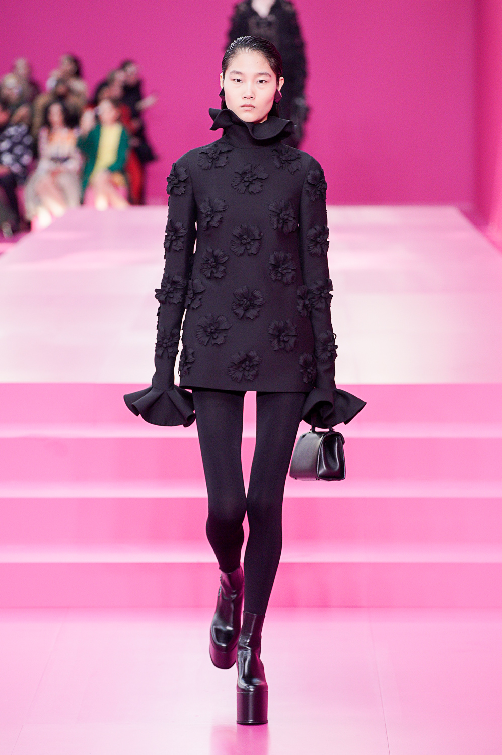
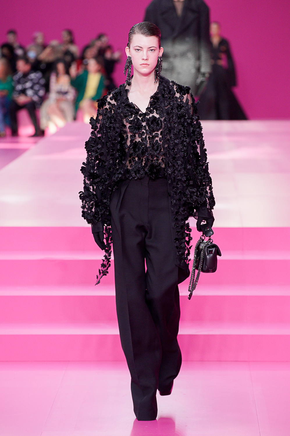
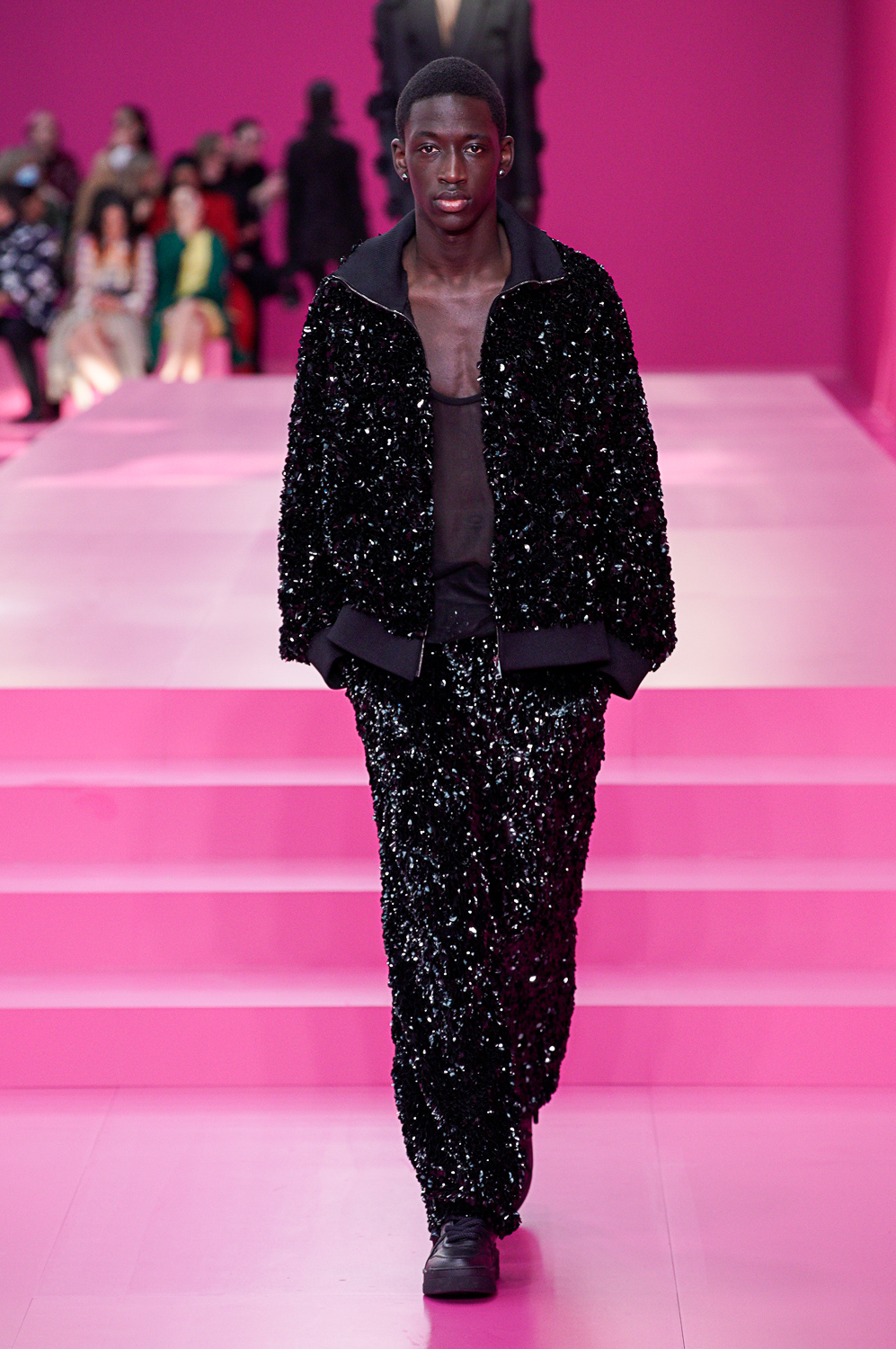
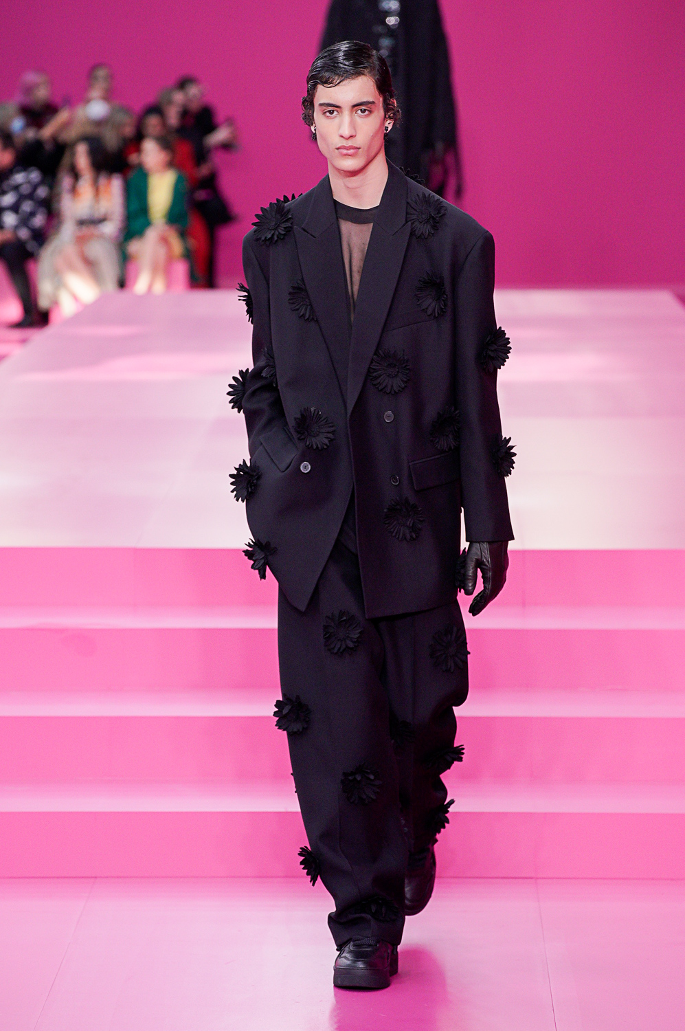
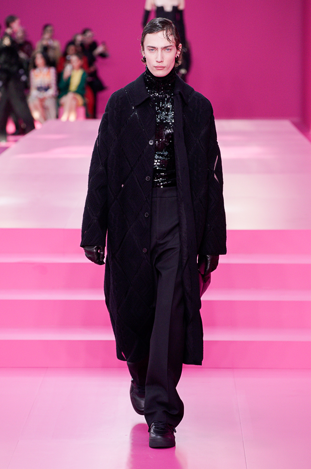
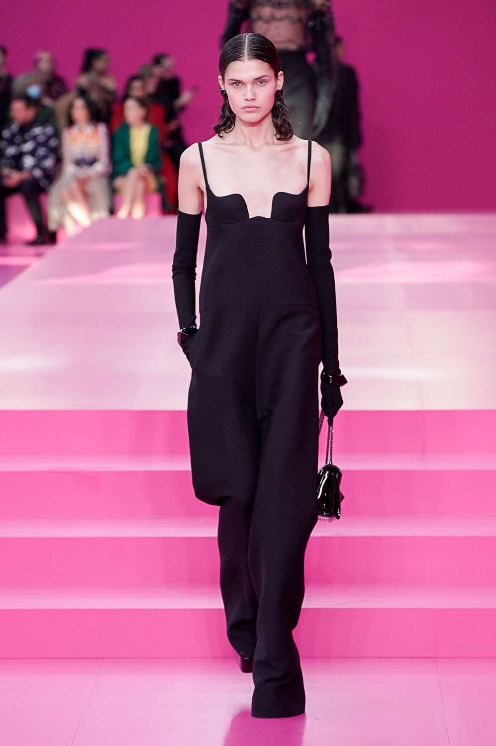
Strangely enough, the cooling-off period provided by the sudden switch to black, mid-collection, showed off the elegance and sensitivity of Valentino’s repertoire to more powerful advantage. What Piccioli does by pairing lace tops or twisted tulle with pants feels modern, and cutting a black silhouette is very much part of the sober feeling that is sweeping fashion for fall.
Editor
Sarah MowerCredit
Photo: Courtesy of Gorunway